Category Archives: new + notable

Wildcat Golf Academy

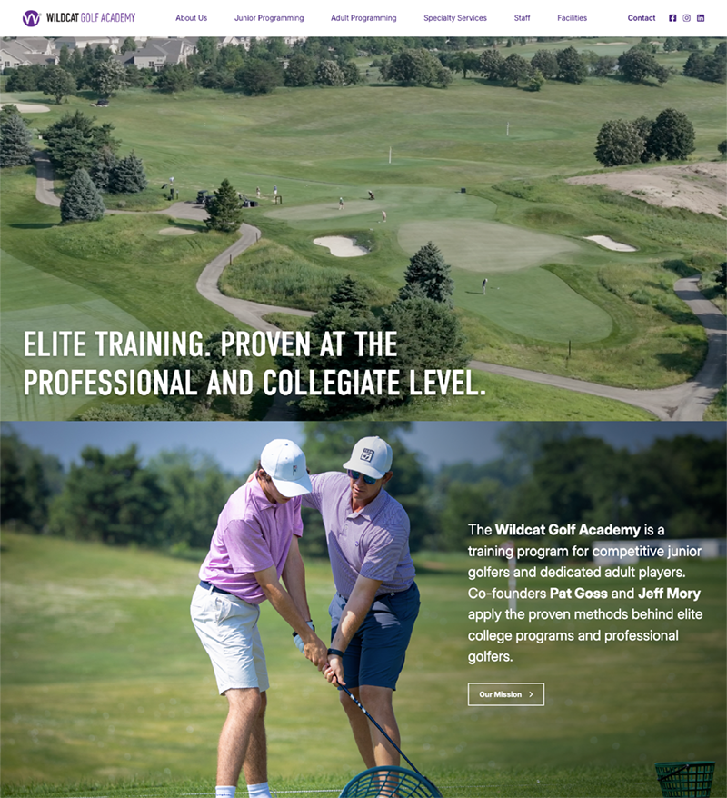
I recently redesigned the site for Wildcat Golf Academy to mark their 15-year anniversary. Founded by Patrick Goss and Jeff Mory, the program—run through Northwestern University (a personal favorite in our family)—helps players of all ages and abilities elevate their game.

The goal: elevate the brand through custom photography (by Charles Cherney) and video (by Mason Flick), so the site reflects the quality of the program itself—and bring the adult and junior programs together in one cohesive experience.

A great example of how strong visuals and thoughtful storytelling don’t just improve how a site looks, but how it feels—capturing the history of the program and the accomplishments of its members. Thanks to Lisa Juscik Jones for trusting me with this project. Check it out here! https://wildcatgolfacademy.com/

Wildcat Golf Academy

Mediterranean Artists Project

I recently worked on the redesign of the site for the Mediterranean Artists Project—an organization rooted in creative exchange, bringing together writers, artists, and thinkers from around the world at an 18th-century farmhouse in the South of France.

The program was founded by three luminaries—and longtime friends: writers Claire Messud and Sylvia Brownrigg, and Itamar Kubovy, a producer of theater and dance.

The goal was to mirror the experience of being there—immersive, inspiring, and quietly expansive. We leaned into the property’s stunning photography, alongside imagery from the program’s events, to capture that sense of place and possibility.

Grateful to collaborate on a project that believes in depth, dialogue, and the long arc of creative work.

And thank you to my longtime friend Pamela G. for the beautiful branding—thoughtfully weaving in the colors of the Mediterranean.

Check it out here! https://maplaverriere.org/

Karen Wickre

I’m on a real roll when it comes to building sites for incredible women. Most recently, I redesigned the site for Karen Wickre and helped her set up her new Substack—The Accumulator. Karen is one of Silicon Valley’s great communicators—an early Googler who helped shape storytelling during the company’s growth from 500 to 50,000 employees. She’s also the author of Taking the Work Out of Networking and a longtime champion of journalism and thoughtful conversation.

The design goal was to create a clean, editorial space that reflects Karen’s voice: smart, direct, and focused on ideas.

Check it out here! https://karenwickre.com/

Shannon Watts

As Shannon Watts’ work has evolved from gun control activist to author, advocate, and thought leader, the site needed to evolve with her — toward something more understated, sophisticated, and editorial.

We embraced a muted, refined color palette, simplified the visuals, and let the content breathe. The result is calm, confident, and purposeful — a design that supports the message rather than competing with it.

Maria Shriver

It’s really intimidating to do a site design for an absolute icon. It was an honor and a joy to redesign MariaShriver.com — the digital home for Maria Shriver‘s journalism, advocacy, and storytelling.

Some highlights:
– A cleaner, more intuitive user experience that helps visitors quickly find the content that matters most to them
– Updated typography and color palette to bring warmth, clarity, and brand cohesion
– Restructured architecture to support Maria’s expanding portfolio — from her publishing imprint, to MOSH, to the Women’s Alzheimer’s Movement
– A refreshed homepage that better tells the story of Maria’s work and welcomes visitors into her world

You can see the new site here: www.mariashriver.com

Products That Count

The redesign of Products That Count was all about clarity, structure, and ease—transforming a high-impact resource into a platform that’s as intuitive as it is inspiring. With so many valuable programs—like the Product Awards, CPO Rising, and Product Talk—we wanted the experience to feel cohesive and navigable, not crowded or corporate.

Some highlights:
– Hierarchy and breathing room: A modern, spacious layout with intentional use of white space lets the content speak clearly.
– Brand voice, visualized: A bold but elegant palette, crisp typography, and thoughtful iconography mirror the confidence and intelligence of today’s product leaders.
– Modular components: We built flexible design patterns that scale easily across research articles, videos, podcasts, and membership features.
– Improved UX flows: Whether you’re discovering a top product leader or applying for the next Product Awards, the journey is smoother, faster, and more human.

This wasn’t just a facelift—it was a deep rethink of how design can elevate community, content, and credibility.

Sarah Bowman Photography

Sarah Bowman wanted a site to showcase the body of her photography work. Included are stunning landscapes, thoughtful black-and-white studies, vibrant portraits and abstract studies that play with light, shape and color. We went as minimal as possible with the site design to allow her work to shine. A sleek masonry grid and popup lightboxes make it easy to browse by category.  Also included is information on how to purchase her work. (hint, hint!)

* On a side note, I always tell Sarah she is my favorite person I have never met. She and I have worked together for more than 15 years on many projects and I just adore her. One of these days, Sarah!

Sarah Bowman

Crime Adjacent

Just launched: crimeadjacent.com — the new home of Crime Adjacent, a gripping podcast diving into the story of the Rest Stop Killer — quite possibly the most prolific serial killer in American history.

Designed in Squarespace, this site balances dark intrigue with sleek usability. I focused on creating a minimalist layout that pulls listeners in without overwhelming the content — eerie, but elegant.

If (like me!) you’re a true crime fan (or design nerd who loves a moody color palette), give it a visit. And maybe… don’t stop at any rest stops.

Work with Leila

Leila Entezam is a Neuro-Emotional Performance Coach based in Southern California. She wished to launch a site in parallel with the launch of her book, The Heart of Peak Performance, Emotional Mastery for High-Performing Men. We built the site in Squarespace, using it to introduce Leila and her methodology, while circling back to the book at every opportunity. We also integrated a self-assessment tool which would allow visitors to help them identify traits that inspire success. Also included are a variety of videos of Leila detailing her approach.

Work With Leila

GujuSis

This site launch is absolutely delicious. Nisha Panchal Patel is a Bay Area recipe creator and culinary instructor (whose previous job was as a tech engineer for two decades!). Nisha was inspired to develop recipes inspired by the Gujarati flavors her mother cooked, combined with the bounty of California produce. We used a vibrant color palette for this site design, combined with fun parallax scrolling and animations to add movement. You’ll find delicious recipes, information on upcoming cooking events, and other opportunities to connect with Nisha. Check it out here!