New + Notable

Love, Amy

So happy to announce the redesign for Love, Amy, a dating coaching service from long-term client Amy Nobile. Amy and I started working together more than 15 years ago, and I’ve been fortunate to help her realize several creative ventures along the way. Featured in The New York Times, The Wall Street Journal, the Today Show (and more!) Amy helps her clients navigate the overwhelming world of modern dating and find real, lasting connections. We rebuilt Amy’s site in ShowIt, the design approach inspired by Amy’s trademark good vibes.

Mend Collaborative

Happy to announce our redesign of the site for Mend Collaborative, a nonprofit foundation focused on restorative justice for survivors of violence. Mend was founded by Rebecca Weiker, whose sister Wendy was a victim of murder and Miguel Quezada who was incarcerated for more than 20 years for crimes he committed as a youth. Often working directly with prison populations, this organization aims to create opportunities for healing and transformation through victim offender dialogues, survivor support, surrogate dialogues, and training.

Although we had a tight budget, we made the most of the assets we had, bringing together the content for a cohesive message. We detailed Mend’s different programs, integrated photos from events, and shared videos which detail the restorative justice process. I could not be more proud to work with Miguel and Rebecca on this important project.

Logue Social

Publishing is one area that has been somewhat slow to adapt to the power of social media. Logue Social assists authors with developing their personal brand, creating and curating content, and growing reader engagement across platform. As my client was just starting out, we needed to keep the budget on the low side. This was the first site that I built with Showit, using a prefab template. It was easy to pick up and the site came together quickly. Look forward to offering this platform as an option to clients in the future.

Shannon Watts

Thrilled to share the redesigned site for speaker, author, and organizer Shannon Watts. As Founder Emerita of Moms Demand Action for Gun Sense in America, she built the largest women’s volunteer organization in America. She’s been named one of Time Magazine’s 100 Most Influential People, a Forbes 50 over 50 Changemaker and a Glamour Woman of the Year.

As she pivoted from work as a full-time volunteer to writing and speaking about women’s issues, she needed her site to reflect this change. We created an aptly fiery logo to accompany her new Substack, Playing with Fire, and carried that look and feel to the new site. The site serves as a springboard for her new endeavors and an archive of past work. I truly couldn’t be happier to be working with such an inspiring woman. 🔥 🔥 🔥

Outlaw Dyno

Just finished a site for Outlaw Dyno, a dyno tuning facility for luxury and racing vehicles based in Victorville, California. (A service I didn’t even know existed as the owner of a beat-up Tiguan.) We made car service sexy with dynamic video, provocative photography, and cohesive branding. An online scheduling platform allows customers to easily book from anywhere.

Chloe Sherman

Chloe Sherman is a celebrated documentary photographer based in San Francisco. With the launch of her new book (Renegades: San Francisco, the 1990s), we revamped her existing Squarespace site, using an intentionally minimalist approach to frame her striking photography.

Mahogany CC

Candice Ramsey, LAMFT, MA, CPC, SPHR is a certified professional coach needing a site to accompany the launch her new practice. We balanced messaging about Candice’s services with a zen palette and stunning photography. An intake form allows Candice to gather potential client information before they initially meet. https://www.mahoganycc.com/

Youngblood Harris

Youngblood Harris is a private dog trainer based in Portland, Oregon. He wanted a hip, modern site that used bold color and (of course) plenty cute dog pics. We structured the site for maximum SEO performance, and made it easy for prospective clients to connect. https://www.trainingwithyoungblood.com/

Deborah L. Borman J.D., LCSW

Deborah L. Borman J.D., LCSW is a Chicago-based therapist, attorney, author and law professor. We created this site to accompany the launch of her professional practice as a counselor. Debbie requested a bold and bright color palette—and requested I integrate the mandala symbol as a motif. Warm and accessible, clients get to know Debbie through this site before they make the initial connection. https://www.dlblcsw.com/

Astraius

Very excited to announce the redesign of the site that I did for Astraius, a commercially operated horizontal launch company for satellites based in the UK. We integrated video, animation, and other dynamic effects to help this company tell their story in an engaging way. We also designed the site’s framework so it will continue to grow along with them. It’s exciting to see this company evolve—when we started working with them, they were in the preliminary stages of research and development. Now they are planning flight for next year. Check it out here! https://www.astraius.com/

DrawTogether

This project was SO much fun! During the COVID school closures, artist Wendy MacNaughton created DrawTogether as a free virtual art class for kids worldwide. Last week, Wendy introduced DrawTogether Classrooms, a free program for educators which offers a growing list of resources. After registering, educators have access to a secure portal featuring videos, podcasts, educator guides and more. This launch was also an opportunity to announce the new DrawTogether branding. Cannot express how much I love working with this creative, brilliant, and lovely team.

Sosogu Ramen & Japanese BBQ

This site was a blast to design. Tobi Miller from Demand Brands Group came to us seeking an unconventional site for Sosogu, a ramen and Japanese BBQ restaurant in Redlands, CA. He wanted animations, horizontal parallax scrolling, and music. Of the final result, he said: “The site you created was sooo damn on-brand and exactly what I was imagining! You made that happen with very little input from me. The site is super fun, creative, and pleasing to the eye – and that’s 100% on point with our brand.” This one is definitely worth clicking through to see the bells and whistles.

Sosogu Ramen website

Awkward Company Picnic

Another exciting site launch this month! Jerry Collins is a comedy writer with more than 20 years experience (working for SNL, Modern Family, Mr. Show and others). He recently launched Awkward Company Picnic, a new company that helps businesses weave comedy, connection and camaraderie into the workplace. We built the site in Squarespace and integrated cheeky social media posts, fun videos alongside practical information and endorsements from stars like Will Ferrell and Eric Stonestreet. Click below to check it out!

Awkward Company Picnic

Finding Elevation

Lisa Thompson is a mountaineer who summitted the highest mountain on all seven continents and who is the second American woman to summit K2, largely considered the deadliest mountain in the world. Her book, Finding Elevation chronicles Thompson’s path from novice climber to world-class mountaineer. More than a climbing memoir, this book explores Lisa’s deeply personal examination of motivation and the human spirit, especially as a breast cancer survivor. Another book site created from Book Landing Pages (link to: https://booklandingpages.com/ ), I loved working with Lisa to promote this beautiful book.

Finding Elevation

Shannon Watts

I’m absolutely thrilled to announce the launch of the site I designed for one of my personal heroes, Shannon Watts. The Sandy Hook tragedy inspired Shannon to start a grassroots movement via Moms Demand Action for Gun Sense in America. Ten years later, and with more than 10 million supporters, this group has made an incredible impact on American gun legislation and public education on gun safety. With endorsements from Nancy Pelosi, Katie Couric, Mike Bloomberg and many others, the site showcases her accomplishments, collects her press mentions, and inspires action.

Shannon Watts

Dr. Sonya Bruton

Dr. Sonya Bruton is the CEO and President of CCI Health Services, a non-profit health system that services more than 78,000 in Maryland. Her book, Finding Your Way in the Nonprofit Sector debuted out this month, a guide to navigating the challenges of the social service sector. Through my Book Landing Pages service (link to: https://booklandingpages.com/ ), I created a site to promote this book, providing a peek inside, interactive quiz, and opportunity to buy online.

Dr. Sonya Bruton

ALL IN CREATIVE

ALL IN CREATIVE is a Los Angeles-based creative agency, producing custom video content for companies like Universal, NBC, HBO, Peacock, and more. This female and minority-owned business was looking for a site that would showcase the breadth of their work, including: red carpet coverage, celebrity interviews, social media promotions and scripted content. We featured more than 60 different video clips in a clean, streamlined design, allowing visitors to focus on the content without distraction. This was such a fun one to put together! Click through—you’re certain to have seen some of the stars and shows they’ve worked with.

ALL IN CREATIVE

Tess Vigeland

A veteran of NPR’s Marketplace and Weekend All Things Considered, Tess Vigeland is an award-winning journalist, author and podcast host. In 2015, Tess embarked on a world tour of more than 20 countries over three years, where she honed her extraordinary photography skills.

Finding a way to amply represent Tess’ body of work was the biggest challenge when redesigning her site. We chose to move her site to Squarespace and created distinct landing pages to represent her vast experiences in audio production and share her photography. (Which are available for sale as prints!)

The end product is a dynamic site that will no doubt grow alongside Tess’ career. Love how this one turned out!

Tess Vigeland

Sage Health Strategy

Another new site launch announcement! I’ve worked with Sage Health Strategy for many years—primarily as design support for their various clients in the healthcare industry. This was an opportunity to work directly with this incredible women-lead team to help them better promote themselves to existing and future clients. Before the site refresh, we updated the overall branding (logo and color palette), giving it a modern look. Next, we applied this new look to the site, while updating the copy to succinctly convey their work. For kicks, we integrated some animation and gradient videos. Check it out at the link below!

Sage Health Strategy website

ETHS Foundation

Another new site launch! The ETHS Foundation supports Evanston’s public high school, raising significant funds to sponsor initiatives that help maintain the school’s status as one of the best public high schools in the country. This foundation helps fund innovative learning spaces, curriculum resources, scholarships, and student assistance.
We used the site’s design to turn the spotlight on the students and successful past enrichment projects. Fundraising is also a focus—the site makes it easy to donate and promotes the annual benefit event, WILD for ETHS. Click below to learn more.

ETHS Foundation website

Los Angeles Children’s Chorus

I’m SO thrilled to finally be able to share the site I built for incredibly talented folks at Los Angeles Children’s Chorus (LACC). This group is where (OMG!) Billie Eilish got her start and remains an active alumna. The site’s intro video shows a clip from Happier Than Ever: A Love Letter to Los Angeles where Billie and the LACC choir performed at the Hollywood Bowl, a show which was later released on Disney+. Just this year, the chorus won a Grammy for best choral performance for its work with the LA Philharmonic. As you’d expect, we pulled out all the stops for this site—animation, video, event management, donations, and more. Check it out yourself by clicking below!

Los Angeles Children's Chorus website

Sara Paretsky

When I started my business 16 years ago (!!!), I was lucky to land best-selling author Sara Paretsky right out of the gate. Sara has published more than two dozen books over her prolific career, and is credited with transforming the mystery genre with her female private eye protagonist, V.I. Warshawski.
This week, I launched the fourth redesign of Sara’s site, showing off her impressive body of work. On the homepage, we used portraits of Sara from legendary photographer John Loengard. We complemented these with gritty, sepia-tinted street shots of Chicago, where her characters regularly inhabit.
Her entire catalog of books are available to browse, as is her blog, which addresses everything from politics to personal musings. I’m delighted how the site turned out and even happier to work with the amazing, inspiring Sara over these years.You can find the site here.

Sara Paretsky website

Book Landing Pages

This site launch for all my publishing people! I created Book Landing Pages as an affordable, effective and engaging way for authors to promote their books.
I’m passionate about books—authors, agents, and publishers are consistently my favorite clients. I created this service because (frankly) there are so many lousy book sites out there. Or there’s no site at all—ceding Google results to Amazon or external reviews. This approach helps authors boost sales, marketing and search engine indexing to help their books soar.
Follow the link below for more info.

Book Landing Pages website

HPA

So happy to announce the rebrand and site redesign for the Chicago-based investment firm, HPA. Their work with emerging startups in a wide variety of industries have made them the leading early-stage investor in the Midwest. We started with logo rebrand and let that exercise set the tone for the site redesign. HPA wanted to focus on the founders, members and partners who define their community, so we restructured the site structure correspondingly. We balanced subtle animation with clean fonts and colors to keep the site friendly and easy to browse. Perhaps most importantly, we configured WordPress strategically to make the site a breeze to update, so we can keep the momentum of the relaunch going. Check it out at the link below!

HPA website

Boardified

Boardified is a Chicago-based organization dedicated to helping Jewish nonprofit organizations build and strengthen leadership skills. Their team has developed a suite of customizable tools, programming, and resources specifically designed to help nonprofit boards optimize their talent. When designing this type of site, it’s essential to help visitors quickly digest the content and drill down to learn more. We used a minimalist design with a bold pop color, and tightly-written copy so the site was easy to browse. Subtle animations and transitions add a bit of playfulness to the design. www.boardified.org

ScoreSwag

ScoreSwag is a site that connects college athletes with brands like Garnier, Audible, Disney, Redbull, Clif Bars, and Axe to help promote their products. The site itself was designed by Adrienne Weiss Corp, but the build and HubSpot integration was handled by our team. This site provided a unique challenge in terms of how to build and track users, and organize the information in a useful way. We also created a user portal where athletes can log in and see which deals are currently available, and which they’ve already claimed.

ScoreSwag website

Jodi Warshaw Edits

Jodi Davis Warshaw has acquired, edited, and published more than 200 books over her career. This year, she decided it was time to strike out on her own. We built jwedits.net to not only showcase the wide array of books she has worked on over the years, but to show the various services she offers. Also crucial was integrating the enthusiastic endorsements she has received from authors. We built the site in Squarespace with bold colors against a white background, allowing the book covers to stand out. I’m so happy with how it turned out!

Jodi Warshaw website

Lulylash

Luly Fatmarani is one of the most in-demand estheticians in the competitive Los Angeles beauty scene. I recently helped Luly launch the site for her new Santa Monica salon, Lulylashbeauty. We used lush, bold imagery to evoke the salon’s high-end services, integrated with the brand’s bold color palette. We built the site in WordPress, and integrated Vagaro for booking and payments. Check it out at the following link: https://lulylashbeauty.com/

Lulylash website

Wednesday Supper

Calling all San Franciscans! Wednesday Supper is now live, delivering one-pot meals with locally-sourced, seasonal ingredients. Founder Nicole Avril is a professionally trained chef, and her rotating menu is to die for (Agnolotti de Plin in Brodo! Chile Verde! Minestrone with Summer Squash and Ditilini!) We built the site in Shopify, making it easy to swap out weekly options and integrate with Mailchimp. One of the biggest challenges was restricting online orders to a specified delivery zone and managing inventory for subscription-based orders and individual orders. I’m thrilled with how it turned out! (But bummed I’m not in delivery range.) Click to visit! https://www.wednesdaysupper.com/

Wednesday Supper website

ASH + AMES

Another recent Shopify launch was the redesign of ASH + AMES. The company shifted its focus from trunk-show and ambassador-driven sales to direct-to-consumer. We created a site with bold product photography contrasted with a minimalist site design faithful to the branding. I love how easy Shopify makes it for customers to purchase online, offering a variety of options. For Black Friday, everything on the site is 30% off (calculated at checkout), so there’s no better time to grab that unique piece.

ASH + AMES website

ReplicaHQ

Replica is a Kansas City-based company that helps public agencies, land developers and communities synthesize data for urban planning. They needed the site to reflect their significant growth and demonstrate their services in a clear way. We migrated their existing site from Squarespace into a WordPress install. In terms of design, we leaned into their colorful data-driven maps and bold photography of bustling city scenes. This set the perfect backdrop for the copy.

Parallax scrolling adds visual interest and to help parse the content in a digestible way. Video is another tool we used to help tell their story. To help gain and track leads, we created attractive landing pages and calls to action so potential clients could easily request a demo and learn more. The contact points are integrated with Salesforce for follow-up.

Misha Zadeh

Misha Zadeh Graham is a Seattle-based designer who has produced an incredible collection of vibrant designs for paper, home, and textiles. We built her redesigned site in Shopify, importing all the products from her Etsy store (and adding many new items). In terms of site design, we let the color and product photography tell the story of her growing brand. Check out her site here: https://mishazadeh.com/.

Misha Zadeh website

Dr. Mark Chien

Dr. Mark Chien is a Chicago-based physician who had worked for years as part of a team in a traditional medical practice. He decided to switch his focus to a concierge model of care, allowing him to better meet the needs of patients. We created this new site to reflect that personal touch and effectively market these services to existing and potential patients.
The site was built in Squarespace platform. In terms of design, we used upbeat photos of active Chicagoans to focus on the health benefits of regular care. The logo uses a limited palette of blue, white and gray, which is echoed in the design. The copy gets straight and to the point to make it easy to browse on both desktop and mobile devices.

Mark Chien MD website

Austin Osteopathic

Dr. Saskia Lytle-Viera recently moved her medical practice from Napa, California to Austin, Texas. For the launch of Austin Osteopathic, she wanted a fresh, bright, inviting site design. Rather than focusing on the aches and pains which might bring her patients to her, she wanted to instead include positive images of the vitality and healing a healthy lifestyle and osteopathic treatment could offer. In addition to information about services, treatment and insurance, Saskia detailed her own personal values and explained the osteopathic approach. Check out the site here! https://www.austinosteopathic.com/

Austin Osteopathic Medicine website

Running is a Kind of Dreaming

Announcing a new site launch for the upcoming memoir Running is a Kind of Dreaming from HarperOneBooks. J.M. Thompson chronicles his personal battle with depression and drug addiction—and how running helped save his life. We used powerful imagery from the book cover to bring the site to life, while highlighting the significant praise that the book has already received. There’s an opportunity to pre-order from a variety of online booksellers, along with detailed information about the book and author. Check it out here: https://runningisakindofdreaming.com/

Running is a Kind of Dreaming website

Fearless Cooking

A new site launch this week! 📣 Fearless Cooking is a cooking school and culinary store in Chicago’s Portage Park neighborhood. After COVID hit, owner Catherine Siebel pivoted all classes to virtual instruction and set up safe ways to shop. She’s introducing in-person classes and extended hours just in time for summer.

The original site was built in a mishmash of platforms, so we moved everything over to Shopify. Design-wise, we made the site’s look and feel much cleaner, bringing upcoming classes front and center and making the checkout process much more straightforward. If I still lived in Chicago, you better believe that my kids would be going to the cool summer camps they have coming up.

Fearless Cooking

The Carter Group

Charlie Carter is a Seattle-based lawyer whose primary focus is advising startups. During his 25-year career, he has formed hundreds of companies, advised through financing, growth, and sale transactions. His business approach is guided primarily by his own personal values of truth, connection, renewal, empathy, commitment, and action. He’s found that when these values align with his clients, magic happens.

He decided this was the year to go out on his own and start his own business. We designed the site with beautiful imagery from the Pacific Northwest and kept the copy tight and concise with clear calls to action. Included are enthusiastic testimonials and links to current and former clients. Learn more about Charlie and his work here.

The Carter Group website

First Due Movers

First Due Movers is a concierge moving service in the Seattle area. Founded by veteran firefighters, the company is rooted in the core values of fire service: trust, honesty, and attention to detail. With the redesign of this site, we wanted to show off the qualities that make this business stand out, while highlighting their impressive Google customer ratings (4.9/5). We broke down the different service offerings step-by-step so customers knew the process and included separate descriptions for each individual service. We included a variety of calls to action on the site to capture leads and optimized the site for indexing.
Check it out at: www.firstduemovers.com

First Due Movers website

Taylor-Smartt

Taylor-Smartt is a Texas-based real estate and holding company with a diverse portfolio of businesses. Included is everything from McCraw Oil to the convenience store Kwikchek to Two Hot Mamas salsa. This site introduces each entity and demonstrates the values which bind the each company together. Check it out here.

Taylor Smartt website

Christina Loff

Christina Loff has done marketing work for some of the most interesting people (Snoop Dogg! DOLLY PARTON!!!) and innovative companies like Wikia, Minted, Chronicle Books, and Hello Lucky. The obvious next step was branching out on her own and founding a marketing and publicity business.

Christina wanted a brightly colorful site with punchy copy. The result is a compact site (built in Squarespace) that’s both minimal and bold at once. You quickly learn about Christina’s impressive capabilities and work, with a clear path to connection.

Christina Loff website

Dream Chicago

My first major site launch of 2021 was close to my heart— Dream Chicago. This Chicago-based nonprofit starts the conversation by asking, “What’s your dream?” The responses fuel a program that brings art programs and opportunities to underserved populations through a dynamic group of artists, dancers, photographers, and writers.

Design-wise, we had a lot of fun, introducing a lot of animation, bright colors (inspired by Chicago’s flag!) and playful fonts. We invited interaction with the Dream Map, where visitors could submit dreams and see them populated on the map.

Founder and Executive Director Heather Treadway said: “I’m so INFINITELY grateful to have discovered you–I began 2020 with my broken foot, followed by a pandemic and more seemingly broken professional and creative dreams…yet hearing your story of recovery (from the same injury, nonetheless), working with you to make our virtual home / website more real and welcoming, and then finding out you have a background in books as I’m trying to realize that dream as well…it just all seems to good to be true. So 2020 is the year I discovered Lisa, and that is something worth celebrating and marveling about!”

Dream Chicago website

Healthcare Services Acquisition

The site I designed for Healthcare Services Acquisition Corp launched just before its December 22nd IPO. HCAR is led by investors, operators and leaders in the healthcare space. The site introduces the company, demonstrates its proven track record in the healthcare industry, and shows its viability for future investors. We used Squarespace as the platform to make it easy to launch a robust site on a short deadline. Check it out here: healthcarespac.com.

HRGi

HRGi is a company focused around reducing costs and regaining control in the medical industry. Offerings include medical cost containment, pharmaceutical cost optimization, and claims reconciliation and analysis. While they further refine their messaging and prep for their official relaunch, we designed this site to tease the offerings and invite interested parties to learn more. This preliminary site was designed to help establish its search engine footprint, tease company offerings and invite engagement from users. We used a page flip scroll to share the content in a visually appealing way and bold graphics to highlight the messaging. Check it out at: hrgi.com

Connected Dots Media

Leslie Jonath is one of the most intuitively creative people I have ever met, so of course it was an utter delight to collaborate with her on her site redesign. Years ago, she founded Connected Dots Media, an agency devoted to bringing creative content to life. The redesigned site shows the variety of beautiful projects she has created, particularly in the world of art and design, cooking, gardening, and children’s publishing.

Connected Dots Media website

Sourcerock LP

I’m delighted to announce the launch of Sourcerock LP, an equity fund using fundamental research to invest within the energy ecosystem. We wanted to show off the strengths of this fund through copy, charts, and imagery, giving potential investors the information they need to jump onboard.

Sourcerock Group website

McCraw Oil and Propane

We just launched the site for McCraw Oil & Propane, an energy company with branches in Texas and Oklahoma. For this project, we brought the separate oil and propane sites together under one URL with a new design. Customers can place orders directly from the site, learn about energy-saving opportunities, and learn about the company and career opportunities.
 
The biggest challenge was combining a LOT of content, while making it all easily navigable. We used tiered navigation and broke the content into digestible blocks with lots of cross-links.
 

McCraw Oil & Propane website

Boys vs. Girls

And now for one of the most ambitious and exciting site launches in LHDE history! Boys vs. Girls is an epic animated adventure series for kids aged 5 – 12 from Stick and Rudder Films. We built this site to show off each character’s distinct personality and added plenty of animation to keep visitors engaged and moving through the content. The production quality of the video and art is so incredible that we went big with the graphics to show it all off. This team was wonderful to work with and I’m thrilled to announce this site’s launch!

Star Corps website

Boardified

Next up in recent launches is Boardified. This organization offers customizable tools, programming, and extensive resources to strengthen nonprofit board leadership skills. We started this project pre-COVID, so the focus quickly shifted from physical to virtual events.

The first phase of this site introduces the organization, introduces its association with Northwestern University and the Board Member Institute for Jewish Nonprofits. A true team effort, If Not Now Creative wrote the copy and Hazen Creative, Inc. did the logo.

The client said, “We truly appreciate help, expertise, and guidance in making sure we put our very best branded self out in the world. We have received nothing but positive feedback from our stakeholders, many of whom have commented on how beautiful and clean the website looks.”

We’re already working on the next phase of this project, but happy to help this worthy organization pivot to meet the needs of this uncertain time.

Astraius

I set a personal record of launching four sites over five days. The next featured site is Astraius, the first site we have ever done for the space industry. The UK-based client wanted a clean, compact landing page that promotes their service of launching small- to mid-sized satellites into orbit. There are so many puns to be made here about how this project was “out-of-this world” and that it was “great to launch” this site, but let’s just say we had a lot of fun with this one.

Astraius website

Jennifer Diamond PhD, LLC

Jennifer Diamond is a Chicago-based psychotherapist who was in the process of launching her private practice when COVID hit. Using Squarespace as the platform, we worked together to create a site that would speak to the significant challenges potential clients might be facing during this unique time in a clear and accessible way. We intentionally avoided the therapy trope of calming nature scenes in favor of bold and colorful graphics and type. We also used a subtle gradient video in the background to suggest change and introduce movement, and wrote the copy to be direct and accessible.

I’m so happy with how it turned out! Check it out yourself at the link below. As an aside, I met Jennifer when we both taught yoga at The Yoga Shop Chicago — she was one of my all-time favorite teachers!

Therapy - Jennifer Diamond PhD website

The Book of Rosy

I designed the site for The Book of Rosy. In this urgent and important book, Rosy, a Guatemalan refugee, tells of being separated from her child and detained at the border during her quest for asylum.

We designed the site to have both an English and Spanish version. Each includes video from the authors, reading guides, and photographs from Rosy’s life. Most importantly, it includes resources for anyone inspired to support asylum seekers and other immigrant neighbors.

This book has already been selected by PEOPLE Magazine, TIME Magazine, PARADE, and ELLE Magazine as one of the best books of the summer.

The Book of Rosy website

The O’Shea Agency

Coleen O’Shea is a New York-based literary agent with years of experience working with best-selling authors. When she founded her new firm—The O’Shea Agency—she asked me to create the site. I absolutely love the list of authors she represents—huge names in health, wellness, personal development, food and lifestyle titles.

Coleen wanted a simple, clean site that showcased her diverse network of clients and their titles. The result speaks for itself—a vast array of best-selling books in a variety of compelling genres. Check it out at the link below!

The O'Shea Agency website

Sandra Carpenter Memorial Fund

When I moved to Cincinnati for my first job after college, Sandra Carpenter
was like my cool older sister. We bonded over work, food, friends, music, and just about everything else.

After she passed away in September 2019, I worked with her friends and family on the site for the Sandra Carpenter Memorial Fund which aims to support promising Ohio women writers who want to explore the world and write, like our dear Sandy. If you know a cool Ohio woman who might want to apply, or if you want to donate to the fund, check out the site below.

Sandra Carpenter Memorial Fund website

What Makes a Marriage Last

The site I built for Phil Donahue and Marlo Thomas’ new book (published by HarperOne launched on Valentine’s Day! In What Makes a Marriage Last, Phil and Marlo talk about their 40-year marriage and interview other famous couples about their enduring unions.

The book includes interviews and photographs from everyone from Elton John and David Furnish to President Jimmy and Rosalynn Carter. Super thrilled to be a part of this project.

As a side note, I’ve been a fan of Marlo’s ever since Free to Be You and Me, which IMHO was WAY ahead of its time. 💕

What Makes a Marriage Last website

Annasea

Annasea is a seafood wholesaler, importer, exporter, processor and distributor based in Kent, WA. This family-owned business started 20 years ago with just six employees, but now has operations in the continental US, Hawaii, and Asia.

The goal of the site redesign was to show Annasea’s global growth and demonstrate their commitment to sustainable fishing and high-quality product. We also showcased their dominance in the emerging poke market. (Their products are found everywhere from Target to Costco.) We used custom video and photography to show the full spectrum of their business offerings. This is one of the most delicious projects to cross my desk in a long time. Follow the link below to see the site.

Annasea Foods Group website

Legal Planet

Legal Planet is a collaborative blog from environmental legal scholars from UCLA School of Law and UC Berkeley School of Law. This site offers timely insight and analysis into energy and environmental law, inspired by the threat of climate change.

The schools came to me looking to refresh the design their site, make it more mobile friendly and bring the site software up to date. Since there are are more than 30 contributors, it had to be easy to maintain. The site also had to integrate a automatic newsletter which was sent with new posts.

I’m so happy how it all came together and even happier to partner with such smart people doing important work.

View the site.

Legal Planet

Helix Design + Build

I am excited to share the launch of the new site for Helix Design + Build, a Bellevue, WA-based home building and interior design business. WOWZA these are some beautiful homes—the hardest part was selecting the photos to use. I worked with the owner to equally promote the different services of the business and let the photography of past work for happy clients testify to their expertise.

View website

Helix Design + Build

Michael Golden

You might see Michael Golden talking politics on Chicago’s WGN, read his articles in national publications like The Washington Post, or listen to his interviews on the Golden Mean Podcast.

He’s also behind social initiatives like One Million Degrees and Spark Chicago and an experienced political consultant. In sum, Michael consistently brings talented people together and helps them create magic.

For his site redesign, Michael wanted a unique, color-saturated design that reflected the breadth of his work, showcased career achievements, and made it easy for site visitors to get in touch.

We worked closely for months to get it all just right. Michael says:

“When your name is part and parcel of your brand, designing your digital calling card becomes a totally personal process. I placed my trust in Lisa’s talent, instincts and judgment every step of the way as we developed my site. It’s one of the best business decisions I’ve ever made. I’ll go back to Lisa again and again on future projects because I know with 100% certainty that she’ll generate the same outstanding results every time. That level of trust is priceless.”

Thanks to Shawn Hazen for the sweet new logo design.

View Web site

Michael Golden: The Golden Mean

No Surrender

No Surrender tells the incredible story of Roddie Edmonds, a humble American WWII soldier from East Tennessee. Not even Roddie’s son Chris—who always considered his father a hero—knew the full details of Roddie’s capture at the Battle of the Bulge or his captivity at Stalag IXA, a Nazi POW camp. But when Chris’s daughter was assigned a family history project, Chris reread Roddie’s wartime diaries, which set in motion a series of life-changing events.

The site introduces this compelling story, showcases exclusive photography, and promotes upcoming tour dates. As always, I just love working with my book people any chance I get. Check out the website.

No Surrender Book, Chris Edmonds

The Law School Playbook

Halle Butler Hara is a lawyer and law professor at Capital University. Her vision was to create a site that provides resources to help law students everywhere thrive—academically, emotionally, and practically.

Included is an extensive podcast series (available on the site, iTunes, Stitcher and Spotify), blog, and invitation to connect. We built the site in Squarespace and her talented husband Josh Hara created all of the illustrations. See the website.

Law School Playbook

Tanenbaum International Literary Agency

Tanenbaum International Literary Agency is a boutique firm located in New York City. With their site redesign, they wanted to tidy up the look and feel of the site, while still showcasing the wide range of their authors and books. Also, it was important to have the site optimized for mobile devices.

We used a dynamic slider to show the books, tightened up the copy, and made the navigation as simple as possible. I know I say this every time I work with a book-related project, but I absolutely love working with the folks in the publishing industry.

See the Web site here.

Tanenbaum International

EVBuzz Consulting

EVBuzz is a new Bellevue, WA-based consultancy that includes top sales and management professionals from the burgeoning electric vehicle industry. Their goal is to poise their clients to meet the demands for this emerging market.

The content is housed on a vertically scrolling site with video, intro to the company, team members, services and contact. We even designed them a buzzy new logo. Check it out.

EVBuzz

Artist, Yvonne Palka

Yvonne Palka is an award-winning sumi-e artist who has written and illustrated a variety of books. Recently, Penguin / Random House published her book, Super Simple Sumi-e, a book a reviewer called “the most adorable book in the universe.”

We redesigned Yvonne’s site to coincide with the book’s release. On the new site, we showcased years of Yvonne’s artwork, information about her background, and peek into her lovely work. View website.

Yvonne Palka

Author Mike Adamick

I recently redesigned the site for best-selling author Mike Adamick, in advance of the publication of his newest book, Raising Empowered Daughters: A Dad to Dad Guide. Promoted as a “fists-up handbook for helping dads help their daughters resist the patriarchy” this book focuses on how dads can raise girls in the modern world who won’t settle for second-class citizenship.

Mike wanted a clean, minimal site which promoted his new book, while referencing the other books he’s written. Absolutely loved working with him.

Mike Adamick

McCraw Propane

I worked with the Chicago-based team at SM Resources to create the site for Texas-based energy company, McCraw Propane. The site was designed to address the needs of both business and residential customers, and serve as an educational resource for propane use and safety.

The biggest challenge was taking a *lot* of information (the site is more than 70 pages) and making it easy to navigate for the various audiences this company serves. We used both keyword and category search as part of the navigation and integrated third-party systems to make managing customer accounts easy.

McCraw Propane

Love, Amy

I can’t believe how long I’ve been lucky enough to work with Amy Menken Nobile and Trisha Ashworth. About 12 years ago, I created a site supporting their best-selling books on parenting and marriage. Later, I was brought in to design collateral and manage the site for jewelry business ASH + AMES. Last year, I designed a site for their latest book, Just When You’re Comfortable in Your Skin, It Starts to Sag.

Amy’s latest solo venture is Love, Amy, a full-service dating concierge service for busy singles frustrated by the complicated world of modern dating. (One client calls Amy her “Dating Fairy Godmother.)

I aimed to create a friendly site for Amy which showcases her warmth and personal touch. Loveamy.co details Amy’s services, demystifies her unique process, and integrates her Instagram feed.  ❤️
Love, Amy

Fight Like a Mother

Really, really, really excited about this site launch as gun reform is an issue dear to my heart. Shannon Watts is the founder of Moms Demand Action for Gun Sense in America the leading force for gun violence prevention, with chapters in all 50 states. Moms Demand started humbly with a Facebook group Shannon created to connect parents following the tragic shooting at Sandy Hook Elementary.

Her book, Fight Like a Mother, is part manifesto, part memoir, part manual for changing the world. In it, she explains how to go from amateur activist to have real impact in your community and beyond. I designed the site to promote the book’s launch and give readers a preview.

Fight Like a Mother

AI Pulse

The UCLA School of Law recently received a grant to study societal and legal changes related to the rapidly changing field of artificial intelligence. They hired me to build the corresponding site—AI Pulse—which invites legal AI scholars from around the country to share research regarding these issues.

They wanted the site to be clean, direct, and engaging, with minimal imagery. The posts are well-documented using footnotes and are available for export as PDF. The content also needed to be easy to search both by category and keyword. We also created the logo to integrate with their mission.

AI Pulse

The Monacelli Press

The Monacelli Press is a Manhattan-based publisher of illustrated books on architecture, fine art, interior design, landscape architecture, photography, fashion and design.

Our task was twofold. First, Monacelli wanted to significantly modernize the site design, allowing the stunning artwork from the books to drive the site’s look and feel. Secondly, they wanted us to connect the book data with Penguin/RandomHouse via API so content would dynamically import into the site daily. Also, we needed to make each book available for purchase from one of five sites.

Shawn Hazen created the design, and I handled project management, development, and site build. (People frequently ask how often we work together, and on this project we did.) We really love the result, which is due largely to the guidance and patience of the Monacelli team (particularly Alan Rapp and Jaime Nelson Noven).

The Monacelli Press

LASSO

I recently redesigned the site for Lasso – Innovative Necklace Storage, a clever product invented by Colleen Adams Chinlund. We used a stop-motion video to show Lasso in action and demonstrated its versatility through a series of product shots. We added the Instagram feed to the homepage to give the site a more dynamic feel. Shopping is easy through a customized Shopify site.

SHOP LASSO

Julia Sweeney Redesign

I have been very lucky to have worked with actress and comedian Julia Sweeney for several years. We recently redesigned her site to reflect the exciting new projects she’s working on. In March, you can find her playing Aidy Bryant’s mother on the new Hulu show, Shrill. And when she’s not filming, she performs solo shows around the country.

We used some of the fantastic photography taken at Chicago’s The Second City theater for the redesign and integrated video and an dynamic events page where you can browse upcoming shows and buy tickets.

Julia Sweeney

Karen Wickre

Karen Wickre is a former Google exec, editorial director or Twitter, and self-described introvert. Her upcoming book, Taking the Work Out of Networking, offers advice to introverts for connecting in an extroverted world.

To coincide with the book’s publication, Karen wanted a site to not only promote her new book, but to showcase her writing, experience, and available services. Aesthetically clean the site gets straight to the point in both design and content.

Karen Wickre

Rowboat Wood

I recently designed the site for Rowboat Wood. A Seattle-based artist, Emma Catherine Potter’s work is unique, meticulously crafted, and utterly stunning. Each piece is tooled by hand from reclaimed and rare wood, alternating colored stains with the beauty of natural wood. Of course I have my own piece, which perfectly suits our woodsy, PNW home.

Rowboat Wood

The Purple House Press

Purple House Press rescues beloved out-of-print children’s books from the 1920s and 1990s and makes them available for today’s families. They currently have more than 70 books available on their site, and have sold more than 500,000 copies since they opened in 2000.

The client came to me looking to redesign their site, allowing the design to reflect the classic artwork from the books, and make the entire site experience clean and streamlined, especially the book search and shopping. The site is built in WordPress, with a WooCommerce cart.

Purple House Press

Sage Health Strategy

I’ve worked with the fine folks from Sage Health Strategy for years. So long that it was high time for a redesign.

Elyse Forkosh Cutler founded the firm in 2012 after working in the healthcare industry for years, and being regularly disappointed by the consultants she hired. This women-run business provides its clients with insight into how to improve their revenue, reputation, and relationships.

Sage Health Strategy

Pamela Druckerman

I’ve been working with author and journalist Pamela Druckerman for the past several years. I originally redesigned her site when her best-selling book, Bringing Up Bébé: One American Mother Discovers the Wisdom of French Parenting debuted.

To accompany the publication of her newest book, There Are No Grown-Ups: A Midlife Coming-Of-Age Story, Pamela was looking to redesign her site again. We went from a long, scrolling page with reviews and her opinion pieces for the New York Times to a very streamlined approach that let the book covers and illustrations pop, allowing her stellar writing stand out.

Check it out at: www.pameladruckerman.com!

PalemaDruckermanHome

Karen Kolbe

When Karen Kolbe asked us to design a site for her psychotherapy practice, she was emphatic—no cheesy sunsets or meandering streams! She wanted imagery that was both meaningful and approachable. We found animal images that did just that. A turtle on its back (“I’m stuck”), a hamster on a wheel (“Going nowhere”), and rhinos locking horns (“Endless Battles”) helped illustrate concepts that potential clients might connect with in a friendly way.

With clean design, bold color, custom icons, and clever copy, you get a clear sense for Karen’s approach. We carefully optimized the site for search engines so she shows up in organic searches in her area.

KarenKolbeHome

Foraged Art

Oh, how I love when Leslie Jonath from Connected Dots Media calls me with one of her creative-genius ideas! Foraged Art is an upcoming book she wrote about artistic projects using objects found in nature. There are no supplies to purchase to create these masterpieces–all you need is the outdoors and your imagination. The process itself is meditative, and will change the way you experience nature.

We designed this simple landing page to introduce the beauty of the book and make it easy to place a preorder. This landing page is the first in a new offering we are doing here at Hazen Creative for book landing pages. More on that soon!

ForagedArtHome

The People’s Music School

The People’s Music School offers underserved Chicago students with an intensive education focused around music. This school came to me looking to redesign their existing site. They wanted to not only improve the design, but position it as a tool to educate Chicago families, connect with the local music community, and garner support through public engagement. We paired stunning black-and-white photography with vibrant color to bring the school and its mission to life online. Absolutely loved working with the team at this school.

PeoplesChoiceMusicHome

We are Perennials

I’ve worked with Amy Menken Nobile and Trisha Ashworth for nearly 10 years, and am thrilled to have built the site for their newest book. We worked together on their previous books exploring motherhood and marriage. Their newest book on reimagining midlife is right up my alley. Smart, funny, and wise, I highly recommend it to all my fellow sisters “of a certain age.” Join the conversation on We are Perennials.

WeArePrennialsHome

Wildcat Golf Junior Academy

Wildcat Golf Junior Academy is program for Chicago’s junior golfers founded by Northwestern University’s top coaches. I designed the original site five years ago, but it was time for a refresh. We used stunning new photography of the indoor and outdoor facilities to show the coaches and students in action and streamlined the look and feel to make the site experience more modern. Fully responsive, you can check the schedule or register from any device.

https://wildcatgolfacademyjuniors.com/

WildCatGolfHome

Share Our Spare

Share Our Spare recently went through a rebranding, courtesy of Chicago’s storied Adrienne Weiss Corporation. I used this gorgeously graphic new identity to refresh the existing site. I rewrote much of the site copy to further demonstrate Share Our Spare’s mission. The tone is friendly, inclusive, and fun, inviting groups and individuals to discover ways they can share their stuff, time, and money to benefit Chicago’s most needy families.

ShareOurSpaceHome

MomAngeles

Another site launch! This one was a redesign of MomAngeles.com​, a site for moms living in Los Angeles. The site includes a curated directory of businesses, upcoming events, reviews, and insider information on the best places for moms and kids to dine, shop, and play in and around LA.

Founder and CEO Laura Nix Gerson wanted a modern, clean (and significantly streamlined) look for her redesigned site. The primary challenge was that there was a ton of legacy content that needed to be reformatted updated for the new design. The secondary challenge was organizing this content in a way that was easily navigable.

I’m so happy how it all came together! And it really makes me want to visit Los Angeles.

MomAngeles

Julia Sweeney

I launched the redesigned site for comedian, actress, writer, and director Julia Sweeney. The site launch coincides with her upcoming stand-up series “Older and Wider” at The Second City (Chicago people, check it out!). Julia wanted a seriously streamlined approach to her new site—clean, modern, and easy to navigate. She will be blogging monthly with thoughts on everything from books to movies to politics. I absolutely love working with Julia!

Amonte Sports

Kelly Amonte Hiller is one of the world’s top lacrosse players. She founded Amonte Sports, an elite lacrosse training program that is primarily based out of Northwestern University, but includes camps and clinics all over the United States.

For her site redesign, she wanted to show the energy of the program through photography and video, while making sure the process of finding and registering for camps and classes was intuitive on both desktop and mobile. The color scheme is faithful to the Northwestern University branding. I love how it all came together: www.amontesports.com.

Studio Lotus Forsyth

The site I designed for Studio Lotus Forsyth is now live! They requested a clean site built around their (beautiful) photos of clients and instructors working in the studio. Subtle elements like transparent overlays and parallax scrolling add interactivity. And we integrated the site with MINDBODY so clients can book online and view the schedule in real time. You can see it at: www.studiolotusforsyth.com

Transforming Chaplaincy

I recently launched the site for www.transformchaplaincy.org, a think tank sponsored by Brandeis University, Rush University Medical Center and the John Templeton Foundation with a mission to promote chaplaincy research in the medical field to improve patient care. The site provides resources for everyone from chaplains to educators and health care providers in an effort to provide all with the tools needed to better integrate spirituality and religion in healthcare.

The challenge with this product was creating an easily navigable site for a lot of research (that will continue to grow). We employed a variety of different ways for users to search and used different custom templates to make the information easily accessible.

Mirikeen Homes, LLC

I recently launched the site for Mirikeen Homes, LLC, a full-service custom construction company located in the Seattle area. (A housing market that is currently.)

Instead of mass-developing homes like many PNW developers, Mirikeen takes a boutique approach. They assume fewer projects at once and work closely with clients for a more personalized, detail-oriented process. On the site, we let the gorgeous photography of these luxury homes shine to show off the stunning results.

Check it out here: mirikeenhomes.com

SweetmanCragun

Earlier this year, I started working with SweetmanCragun, a Boston-based consultancy with offices around the world. As their business grows exponentially, I have helped them refine their message and site to reflect all aspects of their offerings. They are doing some provocative work for clients as they adjust to the global shifts in the world economy. Thrilled to be part of their team.
http://www.sweetmancragun.com/

Helix Homes

Helix Homes designs enviable homes in the Pacific Northwest that are utterly luxurious, yet cozy and livable. Check out the projects category to browse by room. We have two more sites in the pipeline for this company coming up! Branding by Hazen Creative, Inc.

Helix Homes


Rookie Moms Redesign

I’ve been working with my pals at Rookie Moms since *I* was a rookie mom. Having been through a few iterations of the site (which is now as old as our respective eldest children), Whitney and Heather decided they wanted a sort of makeunder for the site—a minimalistic approach to the design that was more modern and let the content take center stage.

Rookie Moms

Share Our Spare

Share Our Spare is a Chicago-based nonprofit that provides new and gently-used clothing, toys, and supplies to needy families of children ages four and younger. With their redesign, they wanted to clearly communicate their mission and urgency (33% of Chicago kids live in poverty). They also wanted to offer a variety of ways people could support them—through gifts of money, time, or donations. Last year alone, they served more than 10,000 needy Chicago children. To all my Chicago peeps looking for a way to give back—this is one fantastic group that can help you support your friends and neighbors!

Share Our Spare

Larry Gets Lost

My kids and I have been Larry Gets Lost fans for quite some time, so this job was pretty exciting for all of us. I worked with Seattle’s Sasquatch Books to create a site that promoted both the 10th anniversary of the Larry book series and provide information on the individual titles.

Larry Gets Lost

Vicky Vlachonis Site Redesign

I recently redesigned the site for Los Angeles Osteopath Vicky Vlachonis. I first worked with Vicky two years ago when her book (The Body Doesn’t Lie) was published. Since then, Vicky has emerged as one of the leading modern voices in wellness and pain management.

For her redesign, we better integrated her blog and social media into the site to provide tools for better living and cultivate dialogue with her followers. With a client base that includes Gwyneth Paltrow (she wrote the foreword to her book!), Katy Perry, Elton John, Chris Martin and Claudia Schiffer, it’s exciting to be a part of Vicky’s journey.

Vicky Vlachonis

Wendy Hopkins Site Launch

The site I designed for writer, performer, director, and consultant (quadruple-threat?) Wendy Hopkins launched late last month. I loved working with Wendy—she’s wickedly funny and whip smart. Dive into her site to view her reel and read her essays (my personal favorite is her Wiggle Love essay).

Wendy Hopkins

Design Feast Profile

Very cool to be featured on Design Feast as part of their Tools series. Read it all here!

Constructing Opportunity

Women make up almost 50% of the US workforce, but only 9% of the construction economy. Constructing Opportunity is a new company devoted to increasing gender diversity within the Architecture, Engineering and Construction industry. The founders came to me looking for a site that would help them convey their mission via an approachable, informed site with a clear call to action for prospective clients. I was thrilled to partner with these inspiring women!

Constructing Opportunity

Jennifer Wisniewski

My friend Jennifer Wisniewski recently asked me to help bring her new line of T-Shirts to life. Graphically, she was inspired by the pop art of Ed Ruscha, so we tried to bring that wry sensibility to the designs. Jenny and I have worked together for years through her Chicago restaurant Bread & Wine and I love it when she calls me with a fun, new project.

Do check Jenny’s blog Tall Orders out as well. It’s a funny and wise look at her life as a model, restauranteur, and single mom in Chicago.

Jennifer Wisniewski

The University of Chicago Medicine

The Gynecologic Specialists of Northwestern has been a longtime client of mine. They were recently acquired by the University of Chicago Medicine and needed an intermediary site that would orient existing patients to the change and help ease the transition to the new UCM system. The result is a streamlined version of the old site, with links into the relevant areas of the UCM site.

What began as one site evolved into a bigger overall project. UCM asked me to develop this site as a sort of template so it could also work for the other practices they are acquiring. As a result, this is the first in several new transitional UCM sites.

http://www.mygyne.info

University of Chicago Medicine

Old Irving Park Association

The site I designed for the Old Irving Park Association launched. I know and love the subject well. (We lived there nine years before moving to Seattle.)

The redesign isn’t just an aesthetic improvement over the existing site (featuring rich photography of the neighborhood and local landmarks). The new site serves to sell this special corner of Chicago to new and potential residents and connect the community in new ways. You’ll find the history of the area alongside photography of notable architecture and public art. You can join the local organization, access local resources and see how you can get involved in community activities.

http://www.oldirvingpark.com

OIPA

ASH + AMES

Over the past year and a half, ASH + AMES has become my biggest client, and provided some of my most exciting work. To accompany the release of their Fall 2016 collection, we created a lookbook, social media campaign, email newsletters, catalog, and updated site as well as some site enhancements. It’s thrilling to be able to contribute so much to their an overall brand vision.

https://issuu.com/ashandames/docs/fall2016

ASH + AMES

Bratworks

The site I worked on with 101-North for Bratworks recently launched. I am super proud of this one. Incorporating cool video (layered with interactive type), and tasty food photography, this site will not only make you hungry, it will elevate your opinion of the humble hot dogs.

Bratworks

Beaubien Elementary

I recently redesigned the site for my boys’ Chicago alma mater, Beaubien Elementary. School sites need to serve a variety of competing functions: easily sharing timely news and information, conveying a sense of the school culture and staff, segmenting content separately for teachers, parents and students, and providing a way for teachers to communicate directly with students.

We achieved this by rearranging the site structure, creating a primary and secondary content field with bold call-to-action buttons, integrating social media, and making sure the site played well on mobile. “Curb appeal” was also crucial. I enlisted my photographer pal Scott Anderson to shoot new photos, refreshed the logo (the bulldog looked a bit feral in previous iterations) and lightened up the entire color palette.

The school is still in the process of building the individual teacher pages, but that will be ready for the start of the new school year.

Beaubien Elementary

Primal Woods

The site I designed for Primal Woods, a Southwest Michigan-based homestead devoted to providing milling services, maple syrup, and handmade soap launched today. The evolution of this space is very interesting–after accepting an early retirement from a corporate job outside of Chicago, John Newell and his wife Geri sought a simpler life closer to nature. Their fascinating blog charts the acquisition of their new rural home and tells how this venture has brought them closer to the earth, their community, and each other.

Primal Woods

Chicago Writers Conference

I have been working with the Chicago Writers Conference to help build their conference registration, which launched this week. This was a fairly complicated process involving a lot of specific logic (you must register for x before you can register for y) and options that accommodated sessions with limited times, spots, and changing prices over time.

I spoke at this conference two years ago (about designing author sites) so it was fun to work with them in this capacity (a little) less scary than speaking in front of a room of people.

Chicago Writers Conference

ASH + AMES

At the end of April, I started managing the social media for my longtime (beloved) client ASH + AMES. I now manage their Tumblr (and blog), Instagram and Facebook pages. I’ve loved this new challenge–especially being able to engage directly with our customers and build our lists.

I try to appeal to all aspects of this business in my posts from the unique beauty of the individual pieces to the celebrity connections (Christy Turlington recently hit me back on Instagram, which was thrilling!) to the sheer empowerment of a business built by powerful, smart women. Our followers and engagement have grown by about 10% since I started–I look forward to growing it even more.

ASH + AMES

Kaplan DeFiore Rights

Here’s another recent site launch to promote. Kaplan DeFiore Rights is a new full-service international licensing agency for publishers and literary agents. Principal Linda Kaplan has more than 25 years experience in and has negotiated licenses on behalf of Gillian Flynn, Martha Stewart, Deepak Chopra, Barack Obama and George W Bush (among many others). We launched this site just in time for the London Book Fair last month.

Kaplan Defiore Rights

ASH + AMES

I recently designed a series of email “drip” newsletters for ASH + AMES. Every new subscriber receives a series of four emails introducing the brand over a series of days. The first email orients subscribers to the brand and its mission, the second introduces the gorgeous jewelry, the third promotes the social media properties, and the fourth introduces opportunities as a brand ambassador. I used a white background to open up the space to the beautiful brand photography and let it really sing. Thrilled with how this one turned out.

ASH + AMES

Wiley & Jobson

The site I designed for Bay Area-based Immigration Law Firm Wiley & Jobson launched today. I designed their original site nearly nine years ago–it was great to help bring the latest iteration of their site to life. This firm has helped thousands of immigrants from more than 75 countries to obtain lawful immigration status. We included a lot of information in a very user-friendly way to help make it easy for potential clients to find the information they need and make the initial contact.

Wiley & Jobson

clarity by lisa viscardi

Lisa Viscardi takes a philosophical approach to home and personal organization. In one of her client’s words, “Lisa cleared my mind, my soul, and my closets. I love her.”

She came to me needing a landing page to coincide with the launch of an upcoming podcast. We turned it around in a week, creating a site that was simple, evocative of her brand, and swiftly conveyed her message.

http://www.claritybylisaviscardi.com/

lisa viscardi

Lisa Hazen Design & Editorial

At long last, today I launch my fully responsive redesigned site! I feel like it was not a moment too soon (Lisa Hazen Design & Editorial celebrates 10 years in business this April.) Please do click through–I’m very happy with how it came together. I tried to keep it modern and minimal, but did put some bells and whistles in there. (On the landing page, the gradient should follow your mouse, for example. Oh, and animated icons!)

Thanks to all who have supported me over these (almost) 10 years. Here’s to many more!

lhde

ASH + AMES

This full-color, 64-page catalog for ASH + AMES was a huge undertaking. A collaborative effort between the entire team, this catalog gives the entire picture of the company—from the stunning jewelry to the philanthropy to how to become an Ambassador. So great to have this baby in my hands after a lot of hard work. And ready to start on the next one, integrating the spring collection!

AA_catalog

DeFiore & Company

The DeFiore and Company site launch represents the third launch in a week. (Can you tell I was up against a lot of end-of-the-year deadlines?) Headed by agent Brian DeFiore (who has worked with Ken Follett, Jon Krakauer, and Ridley Pearson), this Manhattan agency works with some of today’s best-known authors. The site is one of my favorite designs of late—clean and minimal, it lets the various book covers pop and organizes the hundreds of pages (almost 500) into an easily navigable interface.

DeFiore & Company


InStride Advisors

The site I designed for Chicago’s InStride Advisors launched today. Clients like these present an interesting challenge–how to visually represent a service-based consultancy *without* resorting to cliched stock photography. We used color, abstract imagery, animated icons and parallax scrolling to create tell a visually interesting story about the company. I love the result, and the client did, too. Principal Sarah Mayeda said, “This has been a really great process. Creative, organized, and fun.”

InStride Advisors

Quest Modern Design

The site for Quest Modern Design, a mid-century design showroom and studio in Chicago, launched yesterday. The client requested a very clean design that allowed the photos of the different pieces he sells to pop. He also wanted a approach that allowed him to show a variety of different items in a limited space, all while keeping the streamlined look and feel.

Quest Modern Design

The Pilates Klinik

My clients at Reforming Indy in Carmel, Indiana have moved to Perth, Australia! They are in the process of opening a new Pilates studio there as well. I designed their new preliminary site (using the Reforming Indy site as a base). The new site gives enough of a tease to entice new clients before opening and provides plenty of room to grow once they launch their business.

The Pilates Klinik

Frances Goldin Literary Agency Redesign

From The Poisonwood Bible to Goodnight Moon, Frances Goldin Literary Agency has represented the authors of some of culture’s most iconic books. At the helm is uber agent Frances Goldin, who started the New York-based agency nearly 40 years ago. The redesigned site was designed to show off the breadth of the agency’s work, and inform and attract potential new clients. It was so exciting to work with such an established literary agency as they redesigned their site.

Frances Goldin Literary Agency


Feed Your People Site Launch

Last week, the site I designed for the lovely Leslie Jonath to promote the modern community cookbook Feed Your People officially launched. This upcoming book celebrates big-batch cooking: barbecues, rib roasts, clam bakes, seafood boils, fish fries, dumpling dinners, tamale wrapping get-togethers, and other community suppers.

On a deeper level, the book is about building and feeding community, and, fittingly, it will be co-authored by 18 Reasons–a beloved San Francisco-based organization that provides classes to low-income residents and hosts monthly community dinners. Consider supporting this exciting project on Kickstarter!

Feed Your People

ASH + AMES Brand Video Launch

I’ve been fortunate to work with ASH + AMES since its inception and witness it grow into the amazing company it is today. Today, the brand video launched. We updated the site to reflect the evolved mission and show off gorgeous new pieces. All points were integrated into an email and social media launch. I’m loving how it all came together.

Northshore Fireplace Mobile Site

Mobile-specific sites have evolved from being a nice add-on to a total non-negotiable. Longtime client Northshore Fireplace (via Symphony Systems) wanted a mobile version of their site that would help organize the hundreds of products on their site in an easily navigable way. Also essential was the ability to call, map, and contact them to be easy and persistent on each page. With the deployment of this mobile site, we streamlined the experience for these users while complementing the desktop site experience.

Northshore Fireplace

Simple Sabotage Site Launch

Got this one up just in time for the weekend. Simple Sabotage is a book that will ring true for anyone who works–or has worked–in an office. Last month, I shared the landing page I did for this book. The full-featured site launched today. It features an excellent book trailer (seriously watch it), the ability to share your own tales of sabotage, an industry survey and a lot more.

Simple Sabotage


McEvoy Ranch Site Refresh

I’ve been lucky call McEvoy Ranch a client for more than five years. It’s been thrilling to watch them grow (literally) in many ways as they’ve added new product lines (like wine) and expanded their existing offerings (like body care). We recently did a “design facelift,” updating the page templates with a new color palette, images, and fonts, but preserving the same template structure. The auxiliary email confirmations and newsletters were also updated, bringing everything together and updating the look of the entire site.

McEvoy Ranch

Simple Sabotage Landing Page

Another fast-and-dirty book landing page to accompany the release of galleys for Simple Sabotage. (Full site forthcoming!) This modern field manual provides tips for detecting and rooting out everyday behaviors that undermine the workplace. They might sound familiar:

– Insist on doing everything through channels
– Refer all matters to committees
– Bring up irrelevant issues as often as possible
– Be worried about the propriety of any decision
– Make speeches (talk as long and as frequently as possible)
– Haggle over precise wording of communication
– Bring up irrelevant issues as frequently as possible

Simple Sabotage

Landing Page for Give Yourself a Gold Star

I love doing these quick-and-dirty landing pages for new books! This one is a new guided journal named Give Yourself a Gold Star from the amazing Leslie J of Connected Dots Media. It uses the simple motivational method of a gold star to inspire completing tasks small and large. Leslie and I both gave one another a big gold star when we launched the site.

Give Yourself a Gold Star

Wine Labels for Bread & Wine

A labor of love! Bread & Wine Chicago asked me design the labels for their new signature line of house wines, produced in California’s Central Coast. I tried the white last night (a Sauvignon Blanc blend with undertones of citrus, apple, and tropical fruits) and it was amazing. Cheers!

Bread and Wine Labels

The Appetite Solution book site launch

Another diet book from HarperOne! Dr. Joseph Colella is an internationally recognized weight-loss expert and surgeon. In this book, he helps people who chronically struggle with their weight find ways to lose it for good. We included a rotating collection of endorsements, lots of places to buy the book online, an excerpt and video. The site launch was timed to align with his book launch date.

Appetite Solution

The Diet Trap Solution book site launch

I’ve been doing a few of these landing pages for new book launches, and here is a favorite. Here, one page introduces the book, allows orders from a variety of vendors, promotes all the social media links and collects emails for a future newsletter. It loops back to the parent site, while giving the book a nice search engine boost before launch.

The Diet Trap Solution

The Family Savvy site redesign

Today I launched the redesigned site for The Family Savvy–a site promoting activities for families in the Los Angeles area. Together with my awesome client Sarah Bowman, we designed the site to be site fully responsive, played with interesting ways to serve up content through rotators and search, and used bright colors to stand out against a clean white background. Ads were integrated into the copy in a way that didn’t interfere with the content and included dynamic social media feeds to keep the content fresh. I’m super happy with the result.

The Family Savvy

Caring for the Recently Deceased film site launch

Caring for the Recently Deceased is a new dark comedy from Stick and Rudder Films. (In fact, it just got picked up by the Madrid International Film Festival!) I got to experiment with a lot of fun stuff in this design—video backgrounds, mobile use of video, and social media integration. I love how it turned out–from the images to the video to the copy, I feel like it gives a great sense for the film.

Caring for the Recently Deceased

Island Lavender ecommerce site launch

Third site launch of the week. (Get me a beer!) This one is for Island Lavender, an ecommerce site built on the Bigcommerce platform. The lavender for the products is grown on a farm on beautiful Washington Island in Door County, WI. The site offers over a hundred different products for sale–from soaps and scrubs to spices and vinegars.

Island Lavender

Adrienne Weiss Corp site redesign

The client list for branding agency Adrienne Weiss Corp is beyond impressive–Baskin Robbins, Lyfe Cafe, California Pizza Kitchen, and Build-A-Bear to just name a few. They wanted to redesign their site to show off case studies from their body of work and convey how they approach each client differently. We used infinite scroll and animated GIFs to add motion to the homepage and a clean white background so the work popped.

awc-640x595

Youngblood Harris site launch

Youngblood Harris is an Oakland-based dog trainer who requested a site that would promote his services while staying within a tight budget. He wanted the site to have a slightly gritty look, with a textured background and distressed fonts to evoke his personal style. We also added a dynamic contact form so prospective clients could provide detailed information about their needs for that essential first contact. A nice example of a quick-and-dirty site delivered at a low cost.

Youngblood Harris

James Kugel site launch

James Kugel was the Starr Professor of Hebrew Literature of Harvard University for more than 21 years. He’s known as one of the foremost living scholars of Jewish history–over his career, he has written more than 80 research articles and 15 books. We created a site that reflected his vast body of work, and included video of different talks James has given around the world. His Weekly Torah Reading and Bible Q&A sections allows him to interact with many of his readers.

James Kugel

Jennifer Chambers site launch

Today, I launched the site for Jennifer Chambers, a Los Angeles-based director and actor. The site promotes Jennifer’s past work while inviting people to submit new projects for her theatrical production company, Wilder Theatrics. She had great photography from past productions, which I ran full screen to evoke the atmosphere of her onstage performances.

Jennifer Chambers

ASH + AMES ecommerce launch

I am *beyond* thrilled to announce the ecommerce launch of ashandames.com. Although I didn’t design the site (that was NY’s King & Partners, who has designed sites for Victoria Beckham, Mario Testino and Phillip Lim), I did (with my team) design the lookbook, invites, business cards, misc. other collateral and handle site production. I even wrote some of the copy. Beyoncé was snapped wearing some of their pieces, which should tell you everything you need to know about how I feel about this company and brand. Such a joy to work with inspiring women like founders Trisha and Amy!

ashAmes-640x346

Reforming Indy Pilates Studio mobile site launch

Designing for mobile devices is becoming a really big part of what I do these days. Here is the mobile version of the reformingindy.com site I built a few years ago that just launched.

Clients of this Indianapolis-based Pilates and fitness studio can book classes, check the schedule, and view the site all in a mobile-friendly format. Best part is that the design is still evocative of the desktop version, just optimized for mobile.

Reforming Indy Mobile Site

Chicago Writer’s Conference Presentation

I am a speaker at the Chicago Writer’s Conference at 3pm on Saturday, October 25. Click here to access my PowerPoint presentation as a PDF. Please feel free to reach out with any questions!

Seven Ways to Get Your Site in Shape


Russian Tea Time ecommerce site integration

I redesigned the site for landmark Chicago restaurant, Russian Tea Time, two years ago. They recently launched their own line of tea (which was already popular in the restaurant), so we modified their site to support ecommerce to sell nationwide. My husband designed the tins and shot them–I took care of the site integration.

Russian Tea Time

Studio Lotus blog launch

For years, Atlanta’s Studio Lotus has wanted to do a blog curated by their Pilates staff to help add another dimension to their studio and provide useful information for clients to take with them outside the studio. Today, we finally launched their blog, including instructor interviews, video tips, and Facebook/Instagram integration. I look forward to watching this blog grow!

Studio Lotus

Falconer Elementary School site launch

The site I designed for Falconer Elementary–a technology magnet school in Chicago–launched last week. We started by streamlining the homepage–balancing out a photographic slider with an interactive calendar, news and announcements, and clear navigation. We integrated Google Translate into the footer so the site can easily be translated into five different languages to meet the diverse demographic.

We aimed to make the site a useful tool for parents, students and teachers, pulling out resources in the navigation for each group. To improve communication between the school and its families, we integrated social media and brought in email newsletters.

Falconer Elementary School

If Not Now Creative site launch

If Not Now Creative is a new creative marketing agency headed by Paul Kuzma, a Chicago creative with more than 20 years experience with some of the city’s largest advertising and marketing firms.

For this project, Shawn designed the logo and I built the site. The current site is the first step of the agency’s Web launch, with a portfolio and case studies to come.

If Not Now Creative

Sage Innovation Newsletter Launch

Sage Innovation is a collaborative hub for global health experts, creative entrepreneurs and committed innovators. My husband designed and built their site. Using the design as a starting point, I handled the next phase, which was setting up their email newsletter distribution and template design. The template needed to be flexible enough to handle short or long newsletters–I created it in a way that allowed them to adjust the size due to their content.
Sage Innovation Newsletter

Northshore Fireplace Launch

The site I designed for Evanston-based Northshore Fireplace launched this week. This was a very unique project in that the site is built upon the WooCommerce platform, but given the size and price of many of their pieces, they chose to enable a “Request a Quote” feature instead of “Buy Now” as the initial engagement.

The site shows off the breadth of their products and services, including custom fireplace design, installation, and even an gallery section that shows fireplaces in existing homes for inspiration.

Northshore Fireplace

Admissions Essay Boot Camp Book Site Launch

Admissions Essay Boot Camp is a new book from Ashley Wellington focusing on how to help high school students write a better college admissions essay. The site had to appeal to both kids (fun and modern with integrated social media) and their parents (practical, useful, to-the-point). I rarely meet an online quiz I don’t like, so it was fun to make one to help promote the book. (I’m a “Dabbler”.)

Admissions Essay Boot Camp

Landing Pages for 435 Digital

435 Digital is the digital marketing arm of Tribune Publishing (publisher of the Chicago Tribune, LA Times, Baltimore Sun and four other papers across the country). They recently hired me to design landing pages for each of their seven markets to promote their services locally. The templates remained the same, but the messages and content were finessed to appeal to each individual market.

435 Digital

Yellow Pear Press Site Design

Yellow Pear Press is a San Francisco based independent boutique publisher of beautifully designed books aimed to inspire and delight book lovers who appreciate distinctive, insightful, witty, and playful journals, nonfiction and fiction. They wanted a simple site to show the work they have already done—and what projects they have in store for the future.

Yellow Pear Press

Wildcat Golf Academy Site Redesign

About four years ago, I designed the first iteration of the site for Chicago’s Wildcat Golf Academy. Since then, the organization has grown from one that teaches golf to kids to golfers of all ages and ability.

Wildcat asked for a site that showed off the beauty of the course they play on, coupled with modern approaches to design and navigation. We integrated their existing scheduling system into the site and used YouTube’s new playlist functionality to add video tutorials to the site.

Wildcat Golf Academy

Why Your Facebook Fan Page Traffic Sucks (And How to Change That)

I am constantly asked by clients why their Facebook Fan Pages no longer see as much action. Here’s an article I wrote for BookPromotion.com on what changed and how to boost traffic (with paying to boost posts a last resort).

When you first created your Facebook Fan Page, you were probably thrilled how easy it was to build your fans and easily connect with your audience. (And all for free.) In fact, I know many authors have decided to use Facebook as their exclusive Web presence, rather than building and maintaining a site on their own. It was a tough deal to beat—a free networked Web presence with an easy way to share information.

Gradually and quietly, that has all been changing. About a year ago, you probably noticed the appearance of a subtle bar below your posts on your fan page indicating how many people viewed that post. Since then, you’ve probably noticed that number steadily declining, along with an invitation to pay to “boost” your post to reach more users. You may have also noticed seeing fewer posts in your own feed from other businesses that you have “liked” on your own. This has made a lot of users very confused and angry. What gives?

Facebook is reluctant to tip its hand, but it admits, yes, they are no longer showing your page to all of your fans. AdAge obtained a leaked document where Facebook says, “We expect organic distribution of an individual’s page’s posts to gradually decline over time as we continually work to make sure people have a meaningful experience on the site.” They aren’t saying how many users are typically seeing posts, but estimates online (and anecdotal evidence from the sites I manage) suggest organic reach is between 10 and 20%. Facebook’s suggestion to reach more users? Pay to boost posts.

Certainly paying to promote your posts is not an option for everyone’s budget—at least on a regular basis. There are a few things that you can do to help your visitors see more of your posts. Then, you can create content that helps you better promote the posts that you really want to promote when you need to. And when that is in place, then you can consider paying.

Ask Fans to Adjust Their Settings
Admittedly, there are limited things you can do as an administrator to ensure fans see your posts, short of paying for them. But you can ask your fans to adjust their settings so your posts show up consistently in their feeds. This is a slightly complicated process of creating a custom list under “interests.” The best place I’ve seen it explained is here.

Familiarize Yourself with EdgeRank
EdgeRank is the algorithm Facebook uses to govern how it displays content in the user’s news feed. EdgeRank uses three different criteria to determine how things are displayed—Affinity (interaction with the users), Weight (the value of certain actions) and Time Decay (how long ago the information was posted). EdgeRank is a complex topic worthy of an article all its own, but when you better understand how Facebook parses out information, you can mold your content to engage users, and keep your content fresh. Dive deeper into EdgeRank here.

Spend Time with Your Facebook Insights.
At the top of your Facebook fan page is a link to “View Insights” about the activity on the page. Here, you will learn which posts are performing best, trends over time, and how users are engaging with your site. Something I find particularly interesting is the tab that shows you user engagement based on the type—photo, status update, or links. Use this information to serve up the content that your users are responding to.

Pay to Promote—When You Need To
All these things will help you boost your page’s performance. But the fact remains that the rules are now different. Your posts are just not going to have the organic reach that they once did. When it comes to something really important that you want to put out there—like a new book or an upcoming event, it makes sense to invest in boosting your post.

You can start for as little as $5, and Facebook will estimate your reach for that investment. (You can always increase this amount later.) You can choose to promote exclusively to people who already like your page, and their friends. Or you can choose different groups through targeting.

We know paying for posts is not ideal, but it’s worth testing out your options before abandoning Facebook entirely.

Five Web Mistakes I See All the Time

My latest BookPromotion.com article. Mistakes I see online ALL the time.

For years, Glamour Magazine has had a recurring column of “Glamour Don’ts”. The idea is that they find offenders out on the street and show their fashion transgressions, while using a black box to obscure the offender.It made me think of how I am always finding Web “don’ts”—things I stumble across online that aren’t fatal flaws, but that still make me cringe and want to stage a polite intervention. As a public service, here are some of the most common offenses I find.

Cramming everything possible on the homepage
I get it. When people hit your site, you don’t want them to miss a thing. You want visitors to get a good sense for the breadth of information inside. There’s nothing that you want to obscure. But when you load up your homepage with too much content, you’re actually having the opposite effect on your users. Studies show that when confronted with a ton of content, users tune out and (worse) leave. Studies show that users spend between 10 and 20 seconds on a homepage—when you overwhelm it with content, you’re actually making it harder for them to find what they’re looking for. Streamline copy, make your navigation direct and intuitive, and use graphics that illustrate your content. For an author site, you should prioritize the author photo, name, book title, and brief description on the homepage. Then actively link through to more content deeper in the site.

Infinite “coming soon” text
I’m OK with a “Coming Soon” page if something is, indeed, coming soon. (Like within the week.) But leaving those pages empty for weeks, months and even years frustrates users and makes you look bad. This isn’t to say that you should wait until you have every last piece of content before launching your site. Quite the contrary. Keep in mind that it’s easy to add new menus and pages if you’re using a CMS like WordPress. Launch with what you have an keep an eye to content that will help your site grow in the future.

Badly out-of-date information
In my opinion, nothing on a site looks worse than woefully out-of-date content. Maybe it’s a long-neglected blog. Or a page promoting events that have past. Or the obvious omission of something new. (I can’t tell you how many authors’ sites I find that don’t list their most recent titles or articles.) Updating your site content isn’t just a good idea, it’s necessary. When you update your site, you are telling search engines to index your site, you allowing your brand to grow and evolve, and you are (most importantly) providing your visitors with accurate, up-to-date information that represents you well.

No obvious contact information
The main point of having a site is to make a connection with someone. When you obscure or outright omit contact information, you are missing an opportunity to connect with your audience. Obviously, not just anyone should have your home number or personal email. But there are lots of opportunities for people to connect with you in less obtrusive ways. One of the reasons why sites like Twitter have blossomed is that it allows people to have a direct line to someone who is important to them in some way—so use your Twitter feed as a contact point. You may not want to use your personal email as a contact address, but using a separate email address specifically for Web users can help you filter messages and pick them up as you need them.

Out-of-date software
This one is subtle, because it isn’t always obvious. But more often than not, when I look “under the hood” of a new site I’m taking on, there is outdated software. Keeping your software up-to-date is so important that I wrote a whole article about it. If you are using a Web-based content management system like WordPress, and not keeping your software up to date, you are putting your site and your content at risk. Click above to discover ways to keep your site software updated

Historic Island Dairy Site Redesign

The Historic Island Dairy is located on Washington Island, in Door County, WI. Formerly a working dairy farm, the space now serves as a beautiful spot for events, an art gallery, and acres of surrounding lavender fields.

The owners wanted a site that demonstrated the natural beauty of the setting and how the property comes to life when occupied for different events. We ran the photographer’s gorgeous photography full bleed and put the site copy on top, integrating it into the photography.

Historic Island Dairy


Johanna Stein Site Redesign

Eric Stonestreet says, “Johanna Stein is like Erma Bombeck crossed with Louis CK, but without all the f*cking curse words,” which pretty much sums it up.

I met Johanna after a standup piece she did for The Moth where she confessed to having impure thoughts about Steve from Blue Clues. Her book (How Not to Calm a Child on a Plane) pubs next month and I was lucky enough to build her site. I had no idea when I met her how accomplished she was/is.

She writes for major channels (HBO, Nick, Oxygen), collaborates with big stars (Alanis Morissette, Jeff Garlin), and has done some hilarious video shorts. Spend some time on the site–she’s got tons of hilarious videos, excerpts from her book, and an excellent blog (Mother Eff’ed.)

Johanna Stein


Vicky Vlachonis Site Launch

I’m super excited about the launch of this site. Vicky Vlachonis is an osteopath who has worked with everyone from Princes William and Harry (!) to Elton John (!!) and Cameron Diaz (!!!). Gwyneth herself is such a fan that she wrote the foreword for her new book. Here, you can learn some common causes of–and treatments for–pain. Better, she provides a strategy for living a healthy, pain-free life.

Vicky Vlachonis

Case Study: Sara Paretsky’s Critical Mass Web-Only Epilogue

I have worked with author Sara Paretsky for years–she was one of my first clients in my new business and has endured as one of my favorites. I love how creative she is whenever she is promoting a new book. In this piece I wrote for BookPromotion.com, I interviewed her about the online-only epilogue she wrote for her new book that was published exclusively her site, the link given only to her most loyal readers.

Lynne Raimondo Site Redesign

Lynne Raimondo started her career as a high-powered lawyer both corporate and government clients. In 2004, she took what she thought would be a short sabbatical, after years of late nights and living in hotel rooms. Now, she is a published author with two books and excellent reviews for her mystery series featuring blind psychiatrist Mark Angelotti as her protagonist. I redesigned her site in anticipation of her new book and spruced it up with some social media integration and new photography.
Lynne Raimondo

Johnny Dodd Site Design

Johnny Dodd is a staff writer for People Magazine who has traveled the world interviewing fascinating people, both famous and infamous. He is currently in Sochi covering the Olympics, and was on the Today Show this morning as a correspondent. We got this site up in a week in anticipation of both events (an Olympic feat itself). You can read more than 30 stories and read more about books he’s written on the site.

I used a raw wood background coupled with a typewriter font to contrast the difference between the experience of digital and analog. For the logo, I used a cool CSS trick that make it look like his name was being typed out. And we brought the Twitter front and center so he could issue dispatches from the road.
Johnny Dodd
 

Pamela Druckerman Site Redesign

I love it when my clients return with ideas to redesign their site or somehow make it better. When I first designed Pamela Druckerman’s site, she had a new book coming out (Bebe Day By Day). Recently, she took on a role as a columnist for the New York Times, and wanted the site to help her promote articles as they came out. We brought the blog to the homepage. We also added pages for all the many translations her books have been published in–from the Ukraine to Korea.

Mission Cycling Redesign

And yet another site launch for this week–Mission Cycling! This might be my favorite site that I’ve ever done in terms of design. It was hella complicated (integrating Instagram, Strava API, WordPress), but entirely worth it. The end result is a dynamically-updated site that captures the spirit and passion of this cycling group and automatically creates weekly stats as they happen for members. And on a snowy Chicago day, the lush photography makes me miss the Bay Area just a little more.

Mission Cycling

Your Life SPRUCED Site Launch

Your Life SPRUCED is a New Orleans-based personal organizing service that does everything from home organization to staging to project management. The client wanted the site design to be as tidy and clean as her offerings, while having the copy reflect the personal touch she brings to every job. We kept it simple and showed off some inspiring before and after shots in the gallery.

Your Life SPRUCED

BROKEN: Navigating the Ups and Downs of the Circus Called Work

BROKENThe eBook I edited: BROKEN: Navigating the Ups and Downs of the Circus Called Work is now available. I’ve worked for months with the authors–Nate Burgos and Stephanie Di Biase on this project. A great read for anyone who has struggled with work dynamics–especially in a creative capacity–the book is both a shoulder to lean on and a tool to make things better.

Setting Goals in Google Analytics

My latest article for BookPromotion.com is up. Read it all here!

The new year is a great time to set yourself up for success not only personally, but professionally. Experts prove that quantifying your goals can greatly improve your chances of achieving them. Using Google Analytics’ goals tool, you can quantify the effectiveness of how users interact with your site, and then use that information to improve how you serve information. (You are already using Analytics on your site, right? If not, here’s why I think you should be.)

The Redesigned Site for HarperOne’s News and Pews launches

HarperOne is an imprint focusing on religion, spirituality, and personal growth from HarperCollins. Over the years, I have done a ton of work for them–including this News and Pews this site (three years ago). The redesign launched yesterday, updating the site with a more modern look to entice younger readers, and integrating social media in a way that wasn’t available when the original site launched.
News and Pews

Russian Tea Time in the New York Times!

My clients, Russian Tea Time, are featured in the New York Times’ 36 Hours in Chicago!

The article reads: Russian Tea Time is the kind of classic, white-tablecloth restaurant that helps old cities age gracefully. There’s nothing new here, just wonderful Ukrainian-style borscht ($6), Russian herring ($13.50) and Moldavian, Uzbek and Azerbaijani specialties on a busy downtown street. The tea service ($29.95) includes over 30 teas and a spread of sweets and savories such as Pozharski croquettes and rugelach, while the vodka flights feature house-flavored black currant, horseradish and ginger spirits. Just across Michigan Avenue, get a taste of the Art Institute of Chicago’s dizzying scope by dropping into one of its catch-it-while-you-can exhibitions, like “Art and Appetite: American Painting, Culture and Cuisine,” which surveys “the historical art of eating” through Jan. 27.

StoryFront: Amazon’s New Short-Story Imprint

My article on Amazon Publishing’s new short story imprint went up on BookPromotion.com today. Short story writers and readers, check it out!

Historically, readers are accustomed to buying short stories as part of an anthology. Amazon Publishing is changing that with the launch of StoryFront, a new imprint focused on publishing short fiction—story by story. There are 43 stories included at launch, many available for as little as $.99. StoryFront will also be home to Day One, a Kindle-based weekly literary journal introduced earlier this year that is dedicated to new writers and poets. Day One costs $1.59/month or $1.99 per issue.

Read more >

McEvoy Ranch Wine Launch

McEvoy Ranch WineIt isn’t hyperbole to say that McEvoy Ranch is one of the most beautiful places I’ve ever been. This 550-acre ranch in Petaluma, California produces the best olive oil I’ve ever tasted and olive oil based body care products with scents evocative of their beautiful surroundings.

Today, their site launches online sales for their new wine vintages. I can say from experience that they are EXTRAORDINARY (especially Rosebud). Setting up ecommerce for the wine sales and their wine club was quite a challenge, but ultimately worth it. (FYI, wine only ships within California for now.)

Spread the Word this Holiday Season: Give Books

This week’s article for BookPromotion.com

The holidays are almost every industry’s busiest time, and publishing is no exception. As a way to connect their holiday sales with a philanthropic message, San Francisco’s Chronicle Books is spearheading a campaign to get people to pledge to give books this holiday season. For every #GiveBooks Tweet, pin, and online pledge, Chronicle Books will donate a book to a child in need through First Book.

Their goal is 10,000 books, and as of this week, they are halfway there. Help them make their goal by first visiting the Give Books site, and signing the pledge. Then follow up with a pin, Tweet, or more. While it’s always hard to compete with the hottest toys or electronics, there’s also nothing like a book under the tree. Looking for recommendations of great gift books? Check these suggestions from these independent booksellers. (We don’t need to tell you that this is a great way to support the independents.)

Using Analytics to Optimize Your Site

Written for BookPromotion.com

The first thing I do when I sit down to my computer each morning—before I check email or even Facebook—is check my site’s Web stats. Knowing who is visiting my site—and what they’re reading while they’re there isn’t just a way to indulge my voyeuristic side. Here, I uncover valuable information about which of my services are generating the most interest, how people are finding me, and who they are. You can also use the information you find in your stats to help discover what your visitors are most interested in and help them find what they’re looking for. (more…)

Willa Moore CD Design

I don’t often get to work on actual design production work, which is why it was a thrill to work on the design of singer/songwriter Willa Moore’s CD packaging. Together with Shawn and Samira Selod, we created a trifold case with a 24-page booklet and screenprinted CD. I’m thrilled with the result.

Willa Moore CD

The Red Room: Social Networking for Authors and Readers

Post for BookPromotion.com

One of the best parts of publishing conferences is the people it brings together. Authors, publishers and readers all in one place—exchanging information and learning from one another. But publishing conferences are but a few times a year. (And expensive, to boot.) Where to commune outside of the conference?

The Red Room was designed to virtually bring together writers and readers anytime the mood strikes and as often as possible. Conceived as an online salon for authors and book lovers, The Red Room provides ample opportunity for authors and readers alike to come together. Authors can create a homepage on the site where they can blog, showcase their work, post audio or video, and include past reviews. Plus, each author page has the invitation for readers to message them directly. All of this is included as part of a free membership. (more…)

Optivara Site Launch

The site I designed for Optivara just launched. This new company provides software and support for high tech companies, helping clients to gather, integrate, analyze, interpret, and display quantitative data and quantitative intelligence. The site was designed to support and illustrate all four product lines and draw new business.

ASH + AMES Placeholder and Facebook Launch

ASH + AMES is a new social accessories company by long-time clients Trisha Ashworth and Amy Nobile. They are in pre-launch mode, but I just finished their splash page and Facebook fan page. More to come!

Why You Should Join Amazon Author Central

For BookPromotion.com

A lot of my author clients aren’t fans of Amazon. I get it—the advent of Amazon has threatened the existence of indie bookstores and irrevocably changed the way people buy and read books.

But when it comes to participating in Amazon’s AuthorCentral program, in my opinion, this is a case of “if you can’t beat ‘em, join ‘em.” You may never end up loving Amazon, or choose to be their customer. But when you create an author profile through AuthorCentral, you will be helping to promote yourself and your books in the world’s largest bookstore, and for free. One of the things I consistently drill into the heads of my clients is that they need to control their message online. Because if they don’t do this, someone else will do it for them. This is a great way to own your property on Amazon (which already exists if your book is published) and manage the content associated with your name. Plus, creating an AuthorCentral page is just another opportunity to juice up your SEO results. (more…)

Make it Easy to Get Your Books Reviewed

Written for BookPromotion.com

A few years ago, book reviews in print media like newspapers and magazines could make a best-seller. While a great (or awful) book review in a major publication can have tremendous impact on a book’s sales, influential book reviews also appear in blogs, in online bookstores, and social media. The easier you make it for reviewers to access information about your books and you as an author, the more likely it is that your book will be reviewed. Here are some tips to get your book into the hands of people who can help you promote it. (more…)

Steps You Can Take to Protect Your WordPress Site

Written for BookPromotion.com

It’s safe to say that I am a huge WordPress fan—I’ve built more than 70 sites using this platform. And suffice to say that there are a variety of other platforms that I can name that I am emphatically not a fan of. (But that’s fodder for another column.)

My clients also tend to love WordPress as well. Usually within an hour or two, I can train them to update most of the elements on their site with minimal stress. Even some of my most tech-adverse clients have told me that they feel comfortable adding and editing content on their sites—something that gives them a great deal of power when it comes to owning their brand. And it seems that it isn’t just my clients who feel this way. WordPress accounts for nearly one in five sites currently online.

So, what’s the problem? WordPress is a Web-based platform (rather than an application which is downloaded and stored locally). This means that with the correct username and password, anyone with a Web connection can access your site. Also, plug-ins can go a long way towards extending the functionality of a site. But if not maintained and secured, they can provide backdoor ways for hackers to infiltrate your site.

You needn’t abandon WordPress, you just need to be smart about how you use it. Here are some tips for how to keep your site secure. (more…)

An Interview with Timber Buckeye of Buddhist Boot Camp

Before Buddhist Boot Camp was a best-seller, it was a series of personal emails on life lessons from Timber Hawkeye to his friends. When they started sharing his emails with their friends, Timber posted them all on a blog. The author then self-published the content in paperback. That’s when it caught the eye of HarperCollins Publishers, who published what is now a best-selling, compact hardcover book on mindfulness and inspiration.

“The response has been unbelievable,” says Timber. “People were relating to what I had to say, and wanted to hear more. We instinctually have this reluctance to be honest. But when I shared my story about what I went through, people started to share their own stories.”

Read more on BookPromotion.com

We Think Alone: A New Project from Miranda July

I first discovered Miranda July when she was promoting her book No One Belongs Here More Than You in 2007. The book’s site broke pretty much every rule about what I would tell you are the best practices for promoting a book online. (I mean, it’s usually ill advised to design an entire site around writing on the top of your refrigerator with dry erase markers, photographing each message as slide, and making the user click through nearly 30 pages to read the whole message.) Yet, this site remains one of the most memorable, creative and clever book sites I’ve ever seen.

Read more on BookPromotion.com

Bel Air Bar + Grill

I recently migrated the site for Bel Air Bar + Grill from standard HTML to WordPress, and created a custom mobile style sheet for on the go customers. OH to dine there! Someday.

Russian Tea Time Site Launch

The site I designed for landmark Chicago restaurant Russian Tea Time launched yesterday. Celebrating with lunch with the owners tomorrow!

How Not to Be an E-Hole: An Online Etiquette Refresher (Plus: Free eBook Download!)

Written for BookPromotion.com, June 14, 2013

You know that saying that if you can’t find the asshole in the room, that it’s probably you? Well, the same logic applies to e-Holes. E-Holes are people who misuse, abuse, or annoy people through social media. And unfortunately, being an e-Hole is really easy to do. You may not even know if you’re being one.

In this article for BookPromotion.com, I interviewed Sarah Browne regarding the necessity of honing your online etiquette.

Fan Mail from BEA

I love this piece of fan mail I received from a woman who attended our BEA panel. (cut and pasted below)

The seminar on “What’s Working Now” at BookExpo last Wednesday was one of the most lively of the entire event. As we left my husband said, “Those three women could take over the world” and I was in complete agreement. Your knowledge and direct no nonsense delivery–combined with great humor–made you, Lori and Katherine an impressive trio.

Finding Time for Social Media

Written for BookPromotion.com: May 17, 2013

There’s no question: networking with readers and media via social media is an essential piece of modern self-promotion. But it is also time-consuming. Many clients tell me that they feel completely overwhelmed (and turned off) by the different platforms to master, the time involved, not to mention the sustained (and earnest) communication with total strangers.

When you break it down by platform, and make it a habit, the entire process is much more palatable. There are a lot of articles available with tips for how to grow your audience and following via social media. This article tells you how to keep them with your content.

Best Practices for Book Trailers

Written for BookPromotion.com: May 10, 2013

Book publishing continues to find its way in a world increasingly addicted to screens. In a case of if you can’t beat ‘em, join ‘em, video trailers have become a crucial part of a book’s marketing strategy. Following are some exceptional book trailers found in different genres, and a look at what makes them stand out. Some of the following trailers were made on a budget, others slickly produced. All provide a look into the book in a changing world of promoting books.

Read on!

How Users Read Online

Written for BookPromotion.com, May 3, 2013

It’s a tough pill for many writers to swallow—people don’t read the same way online that they do in print. Book authors usually favor long-form writing to short blocks of content. But if you write for the Web the same way you write for print, you may not be connecting with your audience. Studies find that readers scan pages for content rather than digesting large blocks of content. (There’s a reason it’s called “web browsing.”) As painful as it may be to rewrite copy for—let’s face it—a pretty lazy audience, with some knowledge about how information is consumed online and tips for crafting content, you can optimize your message for the Web. (more…)

How Users Read Online article for BookPromotion.com

People don’t read the same way online that they do in print. In this article for BookPromotion.com, I break down how users process content online. Then I offer some tips for modifying your writing for this audience.

How to Get Great Work from Your Designer

Written for BookPromotion.com, April 29, 2013

Pretty much anyone involved in publishing—authors, marketing, publicity, sales— is going to be working with a designer at some point. Whether you’re talking book covers, promotional materials or Web sites, eventually words must assume a visual form.

When creatives from two different disciplines converge, there can often be a communication breakdown. I’m a designer who works frequently with authors. Allow me to help demystify this Venus vs. Mars relationship and help you get the best work from your designers—saving you time and money along the way. (more…)

How to Get Great Work from Your Designer: Article on BookPromotion.com

Pretty much anyone involved in publishing—authors, marketing, publicity, sales— is going to be working with a designer at some point. Whether you’re talking book covers, promotional materials or Web sites, eventually words must assume a visual form.

When creatives from two different disciplines converge, there can often be a communication breakdown. I’m a designer who works frequently with authors. Allow me to help demystify this Venus vs. Mars relationship and help you get the best work from your designers—saving you time and money along the way.

Read More

Email Newsletter Tips for Authors

Written for BookPromotion.com, April 12, 2013

I’m often asked by my author clients if they should include email newsletters as part of their self-promotion strategy. The answer is always an emphatic yes—if done the right way. Below, I identify tips to help you choose the right platform, build your list, and send out emails that will engage your readers—and never annoy them. (more…)

Free Hosting vs. Self-Hosting in WordPress article for BookPromotion.com

It is tempting–oh, so tempting!–to go for the free options when building your site. I wrote this article for BookPromotion.com to break down the pros and cons of free hosting verses self-hosting in WordPress, particularly when it comes to author sites and publishing in general.

Free Hosting vs. Self Hosting in WordPress

Written for BookPromotion.com April 9, 2013

The first step to creating a site is deciding how you will build it. The decision to use a content management system (CMS) is a no-brainer. A robust CMS will make it easy for you to modify everything from the site structure and navigation to styling, images, and content.

The following is a look at the pros and cons WordPress.com—the free version of the popular CMS and WordPress.org—the self-hosted version of the same platform. Although are many of other free and paid content management options available (Blogger and Squarespace, to name two), in my opinion, these two are the best in each class for authors. (more…)

Julia Sweeney’s site launch

The site I designed for author, actress, comedienne Julia Sweeney launched this week! The site showcases the entire oeuvre of her work—from memories of her tenure on Saturday Night Live to her stage shows, and her books. In fact, her new book, If It’s Not One Thing, It’s Your Mother pubs today!

Plus, she wrote me one of my favorite testimonials: “Okay, whenever you send me something new I am so gobsmacked by how beautiful it is, I can barely look for the possible problem areas. Seriously, it takes me a couple of days to recover. I was just thinking, Lisa has the most fun job that she is most wonderful at doing. (Awkwardly worded, yes, but when I think, I’m clunky) Unclunkily, I thought, ‘She must be smiling every day!’ (Of course I know that’s not true, as I live in the real world, but still, that’s really what I was thinking just now…) Lisa, you are so good at your job!”

Article on Designing for Social Media for BookPromotion.com

Whitney Moss and Heather Flett are perhaps better known online as the Rookie Moms.Together, they have a wildly popular Web site (which I just redesigned), two books under their belt, and thousands of followers. They asked me to help them pull together a more attractive social media presence that better promotes both themselves and their various properties.

This article for BookPromotion.com breaks down exactly what I did to better design both their Twitter and Facebook pages.

Designing for Social Media

Written for BookPromotion.com, March 23, 2013

A common complaint I hear from authors and other clients regarding social media is the lack of options available to customize that design. That it’s hard to stand out from the crowd on Twitter and Facebook, particularly.

I respectfully disagree. Look at what a yardsale MySpace became by allowing its users to go nuts with animations, fonts, color, and more. From the start, the two most important social networking properties—Twitter and Facebook—have been very deliberate in the options they offer users in terms of design. But what you do with those options can help you stand out and promote your work. (more…)

What is With All the Lousy Author Web Sites?

Written for BookPromotion.com March 20, 2013

Every time I find a book I love (or even one that I don’t), the first thing I do is find the author’s site. After spending hours with the book, I often yearn to know more about the author and his or her background, to see what else they may have written.

Often, the sites are lacking. And that’s being charitable.

I may not be neutral on the subject—I’ve worked in both publishing and web design for more than 15 years. But authors can no longer rely upon traditional avenues alone to promote their work. And considering publishing’s bootstrapped state, you can’t count on your publisher to manage your online presence.

This article is an open letter to authors to seize control of their online presence. Use your sites to connect with readers, increase sales and propel your career forward. (more…)

First Article for BookPromotion.com

I just joined BookPromotion.com as a contributor, and my first article launched today. Entitled What Is With All the Lousy Author Web Sites, I think you can guess what it is about. This is my tough-love letter to authors out there to get their (ahem) sites together.

On a related note, I am going to be speaking on a panel with the amazing Lori Culwell at Book Expo America this May on this very topic and more.

Rookie Moms Site Redesign

I originally worked with the Rookie Moms—Heather Flett and Whitney Moss—designing their 510Families.com site a few years ago. They recently came to me, asking to help them refresh the look of their original site, RookieMoms.com. Since they launched the site in 2005, it has grown substantially. (As have their respective children—five in all! Rookies no more.) They have an avid online following on both Facebook and Twitter, and two books under their belt. They wanted a site that retained the original look and feel, but reflected the earned sophistication and depth of content. Last, but not least, the site is integrated with their advertising network, monetizing all that content. I love seeing these smart, savvy women succeed in their work!

Egg & Dart Press Placeholder Launches

This is phase one of the Egg & Dart Press site launch–a placeholder introducing four new cookbooks that come out this Spring. As you might imagine, the only thing I like better than books is cookbooks. Can’t wait to get my hands on these.

Redesign of PamelaDruckerman.com

I was absolutely thrilled to work with Pamela Druckerman when she sought a redesign of her site to coincide with the launch of her new book, Bébé Day by Day, 100 Keys to French Parenting. The press she got from Bringing Up Bébé was astounding. This book was translated into various other publishing markets and TIME chose her as one of the 100 most fascinating people of 2011. She wanted her redesigned site to build from that momentum, but introduce readers to her new books, and (of course) make it easy to purchase.

On a personal level, this book came along at the perfect time for me, too, as I wrangled the will of my own adorable, but assertive four-year-old and very American child. It’s never too late!

I love my job!

Two more incredibly exciting clients are now added to my roster: Saturday Night Live alum and author Julia Sweeney, and best-selling author (of Bringing Up Bebe) Pamela Druckerman. (And one of TIME Magazine’s 100 most fascinating people of 2011.)

I Was a Really Good Mom Before I Had Kids viral quotes

Viral Quotes from I Was a Really Good Mom Before I Had Kids

Favorite longtime clients Amy and Trisha from I Was a Really Good Mom Before I Had Kids asked me to design some quotes from their book and site that social media users could share online. It was a blast designing these pithy, often racy quotes. Check them out on Facebook!


Out of the Box Collective Redesign Launches!

Yet another client that I get hungry just thinking about. Out of the Box Collective is a Los Angeles-based service that bridges the gap between local ranchers, farmers, vintners, and artisans with the local customers. Customers are able to order a carefully curated box of delicious locally sourced foods, complete with seasonal meal plans and recipes. I designed the site to combine the company’s wonderful, lush food photography with a whimsical feel with a textured paper bag background and fun slab serif font. Bold colors pop from the header and footer, but the body of the site lets the photography and content pop. The ecommerce platform was built on Delivery Biz Pro.

The Yoga Shop Site Launch

The site I designed for The Yoga Shop Chicago just launched. And just in the nick of time–the grand opening is this weekend! Chicago folks, please try to make it! Sparkling wine, gourmet chocolate, and snacks from Conscious Crumbs!

I will be teaching a Piyo (Pilates-Yoga hybrid class) and Kids’ Yoga there, so check the schedule. Here we go!

An Awesome Client Testimonial

I got the best testimonial today from author Lynne Raimondo!

“Before I met Lisa, I thought a domain was a French estate, hosting was something you did for foreign exchange students, and a wireframe was a painful form of orthodontia. Lisa expertly guided this newbie through the process of setting up an author website and I couldn’t be more pleased with how it turned out. Her design throroughly captures the atmosphere of my debut novel in a format that is easy to navigate and update on my own. Thanks Lisa for an outstanding result!”

Elixir Living Site Launch

I am so excited about the site I designed for HarperOne’s Elixir healthy living imprint. Not just because I used some technology that I’ve never used before when building the site, or because I think that aesthetically, it is some of the cleanest, most appealing work I’ve done. Rather, it is because I really am drawn to the subject matter—publishing (duh!), but specifically books about healthy living, yoga, cooking, and more.

I designed the site in WordPress so books could be easily added and deleted depending on press and publication date. I integrated the site with the client’s Facebook and Twitter feeds, so all channels include the most current information. HarperOne enlisted some of its A-list authors (including Mariel Hemingway, Dr. Joel Furhman, and Dr. Alejandro Junger) to provide Web-exclusive blog content. The blog also includes relevant , where we also include clips from relevant mentions on (for instance) Dr. Oz or The View.

The individual book pages are my favorite. Using a widget developed by HarperCollins, visitors can virtually page through the entire book online, enlarging it to fit their window. The site is integrated with a variety of online print and eBook vendors, so visitors can easily place orders. Best of all, bonus materials are included that are not found in the book, including instructional videos, tools, and more.

Site Launch for Author Lynne Raimondo

Oh, how I love working with authors! Authors and publishing in general are my very favorite niche. (If you didn’t already know, I was Web Director for Chronicle Books for eight years.)

So, when author Lynne Raimondo contacted me to create a site to promote her book, Dante’s Wood, I was delighted. Lynne’s thriller takes place in Chicago, so we had a lot of fun sourcing noir-inspired city scenes and manipulating the photos to make them even spookier. The site is designed to evoke the spirit of this book, but also accommodate future thrillers. And (of course) to inspire sales with conspicuous links to online retailers.

Side note: Lynne has a very interesting history that involves a career in law, losing a case to a guy with a funny name who later went on to become President, and defending Arthur Anderson in the Enron debacle, so I highly recommend checking out her biography on the site.


Mai Le, MFT Site Launch

Mai Le is a Bay Area-based therapist who works with both individuals and couples. She wanted a site that exhibited the breadth of her practice, but also helped potential clients acquaint themselves with her approach and background. Aesthetically, Mai wanted a site that was welcoming, clear, and used images that were neither traditionally “masculine” or “feminine.” Lastly, the site had to be easy to maintain and very search engine friendly.

I’m so pleased with the final result, and Mai is, too. The design of MaiLeMFT.com  is direct, to the point, with plenty of room for growth, and inviting fonts and imagery.

Twitter Page Redesign

This could be dangerous—I’m getting really into social media. I redesigned my Twitter page with the fun new design options that are now available. If you aren’t already following me on Twitter, check it out.

The Yoga Shop Chicago

I absolutely love it when my personal and professional interests come together. A few weeks ago, I heard that a yoga studio was going to be opening up right down the street, I emailed the owner, expressing interest. (I currently teach spin and sub yoga classes at the Irving Park YMCA.) Mere weeks later, I am not only building their Web site, constructing their social media presence, but also teaching at least two classes a week. Here’s a sneak peek at the placeholder for The Yoga Shop Chicago in Old Irving Park. Shawn even designed the logo. There’s so much more to come in the new few weeks!

Is the Chicago’s Teacher Union on Strike?

Let’s just say that I have a vested interest in the answer to this question. As I am nothing if not a steward of my community, I created the world’s simplest site that distills the message to its essence. No more poring through acrimonious news stories again and again for these site visitors! Here’s a site that tells you exactly what you need to know, completely Rahm and Karen Lewis-free.

Is the CTU on Strike?

Reforming Indy site redesign

Reforming Indy represented the fifth Pilates client I’ve worked with. The client came to me with a very specific vision of what they wanted—persistent buttons “stuck” to the side, a rotating slider, and an animated header. They commissioned beautiful photography of the studio, students, and instructors (it’s my opinion that photography can make or break a site). I also integrated their site with MindBody Online, allowing clients to book and pay for sessions online, or check a live schedule.

See case study

McEvoy Ranch site relaunch

Since I started working with McEvoy Ranch two years ago, their business has grown significantly. They needed a robust backend system that could handle their food and body care inventory, as well as tour bookings and tree sales. Although the front-end did not change, we layered the existing design over a new Magento backend with T-HUB integration to facilitate quicker, easier order processing and shipping.

See case study

Barb Best site redesign

Barb Best is an award-winning humorist and author of more than a half-dozen books. In her site redesign, she wanted a playful look that integrated seamlessly with her social media. The colorful site has a blog structure that Barb is meticulous about updating, along with a sidebar which promotes her Twitter, Facebook, and other online presences.

Frog Mom site redesign

Redesigning the Frog Mom site was one of my favorite projects lately. The Frog Mom is also known as Laure Latham the Bay Area-based author of Best Hikes with Kids: San Francisco Bay Area. When we met, Laure told me she was outgrowing her Blogger site, where she detailed adventures with children in the Bay Area and beyond. Together, we created a site that better cataloged her past adventures and built a beautiful framework for new ones. This site never ceases to make me nostalgic for the Bay Area.

See case study

Kondor Consulting site launch

This San Diego-based consultancy works with clients world-wide in clinical diagnostics and the life-sciences. CEO Steve Kondor wanted a site that spoke clearly to this targeted market—especially since he worked with clients all over the world.

Lather Chicago site redesign

Lather is a Chicago-based hair salon that quickly grew from one to three salons—and needed a site to grow with it. Owner Tim Toth is a bit of a celeb in the hair business—having worked on set with A-listers in television and movies. His own salon buzzes with that energy and style, which we tried to bring through on the site. Even better, clients are able to book with their favorite stylists right through this WordPress site.

See case study

Belding Elementary site redesign

This one was a labor of love—my son Finn is a Kindergartener at Belding Elementary. I saw so much potential for how to connect parents, students, and teachers through this site. Using fellow parent Marina Samovsky’s gorgeous photography, I built the site in WordPress using the existing content, and then added extra items like a photo gallery, integrated Google Calendar and blog.

See case study

Napa Valley Osteopathic Medicine site design

Saskia Lytle-Vieira is a Napa-based Osteopath who needed a site that not only allows her to connect with patients, but demystified the role of the Osteopathic Medicine. Her site includes valuable information about her practice, as well as useful resources for people looking to learn more about what Osteopathy can offer them.

The Family Savvy site design

The Family Savvy is an activity guide for Los Angeles parents published by Los Angeles parents. Founded by Sarah Bowman, (co-founder of the popular website, Kids Off the Couch, a former film industry executive (she developed scripts for Spielberg), this site provides carefully curated, up-to-the-moment information on where to go and what to do so parents can be savvy about connecting with their kids and their city.

Link to case study

Cypress String Quartet site redesign

To commemorate their 15th anniversary and new album, San Francisco’s Cypress String Quartet wanted a redesigned site. The design is clean and airy, and allows users to sample music and offers various options to purchase it. The group’s social networking activity is integrated throughout the site, as is the busy events calendar. Despite the fact that there is a lot of information here, the look is very streamlined.

Link to case study

ICU Eyewear site redesign

ICU Eyewear is a Bay Area-based company that offers bright and beautiful glasses for men and women with contemporary styling and refined design elements. This ecommerce site was built upon the Business Catalyst platform to manage an inventory of more than 2600 SKUs of varying colors, magnifications, and styles.

Hartwin.net site design

Hartwin is a Chicago-based company that supplies windows, doors, and more to area architects and contractors. They needed a simple WordPress site to promote their business, provide a way to contact the principlals and integrate vendors.

Wildcat Golf Academy site design

The Wildcat Golf Academy is a program from Northwestern University geared at training junior golfers to compete at the highest levels. The co-founders have worked with some of the biggest names in golf, and together have produced seven Big Ten Championships. This WordPress site uses landscape photography of the different courses with tips and tricks directly from the trainers.

Link to case study

Pilates Center of Chicago site design

The Chicago studio formerly known as Gourmet Pilates wanted to reinvent itself as Pilates Center of Chicago with a new site and logo. This new site is light and airy, with gorgeous photography that shows off the space and beauty of the poses. The WordPress site is integrated with MindBody Online so schedules appear real-time in the site, and allow users to easily sign up for classes.

Link to case study


FLOR homepage animation

I’m absolutely thrilled to be working with FLOR on their user interface and design. This is a homepage animation I designed for them. The goal was to create a dynamic demonstration of how individual tiles and adhesive dots easily assemble into beautiful, unique rugs. The animation is built in jQuery and designed to be easily updated with each new catalog that is launched.

Bread and Wine site design

As bread and wine are two of my favorite things, I was thrilled to work on the Web site for this new Chicago neighborhood bistro. The site was designed using a WordPress template that allows the owners to easily manipulate the menu, send newsletters, and edit information as their opening day approaches. I was so bowled over by their menu, that I negotiated partial payment in trade.

Link to case study

Connected Dots Media site design

Over her career, Leslie Jonath has seen more than 300 books through to publication as an editor. She recently launched her own book packaging company, Connected Dots Media. Here, you can find past publishing projects, learn about the book categories she services, and learn about how her services work.

Jamie O’Reilly site redesign

I met Jamie through the work I did for Women’s Media Group. Jamie is a Chicago-based performer, producer, consultant and media personality. She needed a site that showed the body of her work, provided audio samples, linked through to buy albums, and promoted new work.

Christian Family Coop site redesign

The previous site for the Christian Family Coop was not utilizing the Web medium well at all, and parents and teachers alike requested a redesign. This site uses beautiful photography of the children in action coupled with news and information about upcoming events and program information. It also makes it easy to contact the director to enroll your child or just find out more.

Janice Cole site design

Janice Cole had already been running a successful blog about homesteading chickens—Three Swingin’ Chicks. This blog helped her sell a cookbook/memoir to Chronicle Books entitled Chicken & Egg: A Memoir of Suburban Homesteading with 125 recipes. Janice commissioned a new site that promoted her book, redesigned her blog, and showcased her other work in recipe development and food styling.

Euphrates Institute site redesign

I just loved working with the folks from The Euphrates Institute. This nonprofit is dedicated to bridging cultural gaps and misunderstandings between the US and the Middle East in the wake of 9/11. They wanted a site that brought together their work, but also inspired other students and individuals to participate in their movement. Using lush photography against a minimalist background, the site brings together a lot of information beautifully.

Link to case study

Zoom Eyeworks site launch

Zoom Eyeworks is a California based company that manufactures and distributes eyewear for brands including ICU, Dr. Dean Edell, ZoomSun, and Fisherman Eyewear. They needed a corporate site that highlighted the quality of their brands, along with promotional information like relevant press. Working together with Shawn, we designed and built a minimalist site where the product photography carried the design aesthetic.

The City Coiffure site launch

Maria Martinez is a hairdresser who currently lives in Dublin, but who has worked all over the world. She cites her styling inspiration as coming not from the celebrity rags, but rather from urban style. This site serves as a virtual lookbook for hairstyle trends, as captured by Maria’s camera on the street. Maria’s incredible photography is paired with her narrative, which deconstructs each style.

Link to case study

Women’s Media Group site relaunch

Women’s Media Group is a Chicago-based group that promotes the public dialogue of women’s issues from a feminist perspective, via radio, film, recordings, social media and the Internet, as well as live production. The group needed an easy way to promote new shows and provide them through the site as podcasts. We used WordPress to build a site that allowed them to promote the vast breadth of their media and provide audio playback right in the site.

Designer Spotlight: Hyperakt

Brooklyn-based Hyperakt is a firm opposed to the notion that design is just about making something pretty. Here’s a profile I wrote for HOW on this design firm.

The Sacred Thread site launch

This site was designed to promote a new book which pubs in the fall from Crown Publishers. The Sacred Thread tells the story of a woman who became a mother through an Indian surrogate. The site was designed to not only promote the book, but become a resource to families seeking international surrogacy through resources and a blog.

HOW Creativity Column on CBX

At branding firm CBX, they’re not just selling a logo, they’re selling a story. Talents gleaned from the dramatic arts (and even the martial arts!) help sharpen this staff ‘s presentation and branding skills. Here’s how they do it.

McEvoy Ranch Site Redesign

When its original site was designed, McEvoy Ranch just sold olive oil. Over the years, they expanded their business into a body care line, specailty foods, ranch tours, and merchandise. They needed a dynamic site that not only served as an efficient ecommerce portal for their retail arm, but promoted the ethics and spirit of this beautiful Petaluma, California-based company. Built on Adobe’s Business Catalyst platform, this site supports all aspects of this family-based business.

Giles and Associates Site Launch

Giles and Associates is a Chicago-based management consultancy specializing in the healthcare industry. Their existing site was designed more than five years ago—they needed a site that conveyed the sophistication of their firm and clientele. I set them up with a custom WordPress design that better evokes the nature of their business and helped them finesse their copy for optimal search engine optimization.

Small Group Guides Site Launch

Following the launch of News and Pews, HarperOne requested a small site for them that promotes their Small Group Guides. Since they had a small budget, they elected to use a prefab WordPress template, rather than creating one from scratch. I configured it to their specs, and they took on the task building it with their own information.

Designer Spotlight: WORK TO DATE

Greg Bennett’s day job is a senior design director for Baltimore, MD-based Siquis Ltd. But for the past 11 years, Bennett has been ramping up his personal portfolio that he calls WORKtoDATE, a collection of stunning, visually driven work that includes branding, corporate identity, print and interactive design, packaging and conceptual illustration. Here’s the profile I wrote on him for HOW.

News and Pews Site Launch

HarperOne came to me with a unique project. They wanted to create a site that would help them better communicate with their audience. A blog wasn’t what they were looking for—rather, they wanted a site that would solicit subscriptions for a full-featured newsletter, and act as a static resource for past newsletters. As an incentive for signing up, they offered a free book giveaway. I created both a long form and announcement version of the newsletter using Campaign Monitor, so staff could easily send out newsletters through Campaign Monitor’s Web interface.

Smidgens Studios Site Launch

Andy Jusick is a Chicago-based advertising executive and illustrator who has dreamed of writing a children’s book his entire life. When that dream became a reality, he asked me to build a site for him that would help bring his books’ characters to life.

510families.com Site Design

The site design for 510 Families has been one of my all-time favorite projects. The site comes from the Rookie Moms, who used the success of their inaugeral site to create this site, which provides a comprehensive list of fun things for families of the East Bay of the San Francisco Bay Area. I love how it all came together, and not just because it involves some of my old haunts.

Link to case study

HarborDucks.com Site Launch

I had so much fun designing the site for Saugatuck, MI-based Harbor Ducks. This 30-foot amphibious vessel can handle both land or sea. The look of this site (with a custom design on a WordPress platform) is playful, while incorporating scenic shots by local photographers. We turned around this site launch on a tight deadline to make it far in advance of the busy Spring/Summer tourist season.

Link to case study

Family Values – HOW Magazine May 2010

Read as a PDF

The Post Family isn’t some grandiose design collective. Rather, this group of seven Chicago designers operate more like a family, with support, collaboration, and their fair share of healthy debate. (more…)

DrStreicher.com Site Redesign

Almost three years ago, I designed a site for Dr. Lauren Streicher, who is one of the most well-known OB-GYNs in the country. Lauren asked me to update her site with video from her ample media reel. I had the videos converted and integrated them into the existing site. The result is a site with a greater emphasis on the different media that Lauren has contributed to.

StudioLotus.com WordPress Redesign

About a year and a half ago, I redesigned the site for the Atlanta-based Pilates studio, Studio Lotus. At the time, they were using Adobe Contribute to do site updates. But they decided to migrate the site to WordPress platform to make managing dynamic site content even easier. We created a custom calendar that allowed them to easily manage class schedules for the different studios, and a dynamic contact form that streamlined the communication process with clients.

Link to case study

680docs.com Site Design

The Affiliated Physicians of Suite 118 is a group of board-certified internists on the faculty at the Feinberg School of Medicine at Northwestern. While these doctors practice independently, they share a an office and resources. They wanted a site that would cut down on calls to the front desk, by offering answers to frequently asked questions, downloadable forms, interactive maps, and contact information.

Link to case study

stephens-studio.net Site Build

Stephens Studio is a Carlsbad, CA-based graphic design and marketing company who needed an online prescence to promote their business. They designed their site themselves and had me build it for them. The site utilizes dynamic PHP pages to serve up their work by category. Thumbnails shuffle on the homepage to rotate through their work. And using a Javascript rotation, the images on the homepage cycle through their message.

NRSV.net Site Redesign

Three years ago, I designed a site to help promote the New Revised Standard Version of the Bible (NRSV). Proving that publishing’s changes affect even the market for Bibles, HarperOne wanted to redesign this site so it was more geared toward generating Bible sales. The redesigned site is built (of course!) in WordPress, allowing HarperOne complete control over promotion and updates going forward. And the austere design aesthetic (with the colors of a sunrise in the header, coupled with blues, purples, and bronze) gives a sophistcated approach to the physical design.

Link to case study

SOMA Pain Management Center Site Design

SOMA Pain Management Center is a Chicago-based practice with a holistic approach to medicine. They wanted a bright, clean site design that demonstrated the uniqueness of their practice and communicated the diversity of services they offered. I used WordPress to create a site that is easy to maintain, and very search-engine friendly.

HOW Feature Article on The Post Family

The Post Family is a group of seven Chicago creatives who have achieved the creative ideal—finding an curating a collaborative space that they use as a gallery, workspace, and even a place to host kick-ass parties. Here’s how they made it happen.

Life Events with Creatives feature on HOW Blog

Creatives infuse their talent into pretty much everything they do. I wrote this feature for HOW magazine’s online presence, which shows an amazing stop-motion wedding invitation created by two Chicago-based creatives. After four months and nearly 5,500 photographs later, they created a video wedding invitation their guests (and likely you!) will never forget.

59 North Site Design

Sandra Carpenter is a travel writer living in Stockholm. She wanted a site that would take her existing blog content, and expand it into a site including travel tips, a portfolio of her existing editorial work, and also promotes her book project. 59 North is the result—a dynamic WordPress (of course!) blog that also integrates her husband’s exceptional photography as part of the design.

Boston Body Pilates Site Redesign

Boston Body Pilates wanted a redesigned site that’s dynamic, evocative of their studio space, ably represents all their offerings and locations, and easy to update. I used WordPress as the platform—and JQuery to create different rotating messages on the homepage. I integrated Boston Body’s existing scheduling software into the site design, so clients are able to reserve classes, buy class packages, check schedules, and even send gift certificates through the site.

Link to case study

Rebecca Walker Email Newsletter Template Design

Rebecca Walker is an author, blogger, speaker, and teacher. (TIME magazine even named her one of the 50 most influential people of her generation.) She needed a versatile email newsletter she could use to connect with fans, promote new writing, events, and more. I designed and built a template that she can maintain herself using Campaign Monitor that is as evocative as Rebecca’s personal style as it is informative.

The Swell Season Site Refresh

To coincide with the launch of their new album, Strict Joy, Oscar-winning singer/songwriters The Swell Season wanted to make significant improvements to their site. At the behest of Glen Hansard himself (read about my fun night out with the band here), we added a discussion board, custom Twitter feed, integration with social media sites, and many personal photos to the site.

Link to case study

Voices of the Holocaust Launch

I’m so thrilled by the launch of this site. This site collects the earliest-known oral histories of Holcaust survivors, recorded by Dr. David Boder on a wire recorder in 1946. This site restores those recordings and makes them available online. It also maps the locations or survivors and provides a detailed history of these survivors. For this site, I created the user interface (which necessitated intricate search functions), and the physical design.

LakeviewPt.com Launch

Lakeview Physical Therapy had created a Web site six years before using a (now antiquated) Web authoring software. Needless to say, they were eager to update their look to better reflect their service and range of work. Using an existing WordPress theme template, I worked with their limited budget to create a site that was easy to maintain and much more visually pleasing. (Not to mention, super search-engine friendly.)

Sara Paretsky Redesign Launch

To accompany the launch of her new book, Hardball, Sara Paretsky wanted to redesign her existing site, and make it more modern, dynamic, and easy to maintain. WordPress enabled us to easily maintain tour information, integrate her existing blog, create a dynamic content management system, and refer sales to a variety of different online venues.

Link to case study

Motivational Miracle Launch

Candy Lopez is a Bay Area-based motivational speaker. She found that she was losing out on business because she did not have a robust Web site. We designed this site to show not only the types of services Candy offers as a speaker, but also her personal experiences and how they have shaped her professional life. A balance is struck between a strong, professional presence, and a human, compassionate approach.

Incorporating Movement Overhaul

I built Incorporating Movement more than two years ago. Pilates instructor Rebekah Rotstein needed to revamp her site to accommodate a growing demographic of Spanish-speaking clientele, new services, travel events, and exciting press she had received. I gave her site a mini-makeover, establishing new sections, dynamic rollovers, and an enhanced section exclusively for Spanish speakers.

JulianneBalmain.net Launches

Have I mentioned how much I love working with authors? Julianne Balmain (pen name: Nadia Gordon) is a San Francisco-based writer whose fourth mystery novel (Lethal Vintage) just pubbed. Her site was about 10 years old, but she really wanted a place to promote the new book, events, and other writing projects. Julianne had a limited budget, so I built her templates in a WordPress blog, then taught her how to build all the pages. The result is a dynamic, extendable site that she has full power to update and maintain going forward.

AnneMoore.net Launches

I was delighted to work with this Chicago-based author to create for her a WordPress-based blog where she could promote past work, solicit new work, and muse on different things that inspire her. To keep costs low, we tweaked an existing WordPress template to make it entirely her own, and then incorporated some of her son’s fantastic photography to illustrate the fiction.

Designs for Voices of the Holocaust

In 1946, Dr. David Boder headed to Europe to record the stories of Holocaust survivors in their own words, using just a wire recorder. More than 60 years later, these survivors’ voices are being heard again through this ambitious project, where the oral history can be heard through Flash movies on this site. I was honored to create the user interface and design for this inspirational site.

Launch of I Was a Really Good Mom Before I Had Kids

Authors Trisha Ashworth and Amy Nobile have definitely stirred up something with modern mothers and wives. Appearing everywhere from The Today Show to Oprah, these women have authored three different books that aim to tell the truth about motherhood, marriage, and being a modern woman. This site was designed to create a dialogue with their readers and encourage others to post their own “dirty little secrets” about their lives.

Link to case study

Launch of Guiding Hands School Site

Based in El Dorado Hills, California, the Guiding Hands School is a special-needs school for children aged 2 – 14. The school requested a site that not only showed the diversity and spirit of their student body, but also gave parents a place to learn about events, programs, and connect with teachers. I had a lot of fun designing with the photos they provided and playing with their purple, blue, and yellow color palette.

Back from maternity leave!

After taking some much-needed time off after the birth of Cormac Peter Hazen in November, I’m now back at my desk. I’m currently filling up my schedule with new projects for the coming weeks and months. Please feel free to contact me if you’re interested in talking about your Web or writing project!

Iron and Wine site design

The site for the music group Iron and Wine provided a lot of different opportunities for interpreting their music through the Web medium. We built this site using the Good Barry platform, which allows the band to easily maintain dynamic information like news items, promotions and tour dates. We also created two different media players that allow visitors to both stream entire albums and experience live music via the homepage.

Studio Lotus site redesign

The owner of Studio Lotus, an Atlanta Pilates studio, came to me because her site had outgrown its existing design. The site needed a structure designed that would appeal to new customers, existing clients, and teachers looking to bolster existing education. Using her existing collateral as a basis for the redesign, I better adapted her palette to the new design, and redesigned the interface with drop-down menus to help users better navigate the site.

Guiding Hands site design

This project came to me through my trusted programmer, Kim Flournoy. She had been hired to build a site for Guiding Hands, a California-based special needs school. All they needed was a designer. After working with their team, we came up with a colorful palette that showed the diversity of the children and programs the school offered, along with a structure that makes it easy to find a variety of information. Here’s a screen capture of the site. 

Fringe Home site launch

This site was a collaboration with another Chicago-based designer, Amanda Mans of Blueprint Design Group. Amanda created the design for the site for this Oak Park, IL based interior design business, and I built out the site. I loved bringing Amanda’s designs to life.

djandersonconsulting.com site launch

I created this site for DJ Anderson, a Bay Area-based career and life coach. With this site’s design, DJ wanted to create a look that was distinctive and stood apart from other coaching sites. (During our research, we found that there are far too many sites with rainbows and bursts of light.) We used a refined palette that was soft enough for individuals, but sophisticated enough for corporations. And we used the metaphor of stacked rocks to indicate that the person was on the right path.

MyGyne.info site launch

Gynecologic Specialists of Northwestern is a new practice recently established by three of Chicago’s best doctors. (Dr. Lauren Streicher frequently appears everywhere from print to TV to radio, addressing issues of women’s health and was recently named one of Chicago’s top doctors by Chicago Magazine.) In collaboration with the introduction of their new practice, the doctors wanted to launch a site that would allow them to interact with their patients in a variety of ways. On the site I created for them, you can search for detailed information on more than 100 different gynecological conditions, surgical options, or procedures. You can access post- and pre-operative instructions and request appointments and prescriptions online. You can even log in to access test results or send a secure message to any of your doctors.

Old Colony site launch

Old Colony creates a variety of co-branded snacks with well-known companies, like Andes, ReaLemon, and Musselman’s. (You may already have sampled their snacks on airlines, one of their biggest clients.) They needed a site that enabled direct sales to customers who wanted to order their products by the case, and facilitate inquiries from new customers. Everything on this site was handled from scratch (so to speak). Shawn shot all the photography and I rebuilt everything on the Good Barry platform.

Thomas Claire site launch

Paint-your-own pottery studios are common in pretty much every town across the country. Thomas Claire Kristin LaMarre wanted to take that successful business model into consumer’s homes. Her new business is completely Web-based—you order their pottery kits online, and everything you need to create your own custom pottery is sent to you. You simply return it in their pre-paid packaging, they fire your masterpiece, and they send it back. The model is great for rainy-day crafts or parties. The site design presented a lot of different challenges in customization, but with the programming skills of Pixel IQ, I’m thrilled with the result.

Rock Your Website article for HOW magazine

A common failure of current Web sites is that once they’re built, they sit. Simply having a Web site is no longer enough. A site must be a dynamic destination that acts as a bold advocate on behalf of this subject. In this article, I interviewed a number of experts who advised readers on how to take their Web sites to the next level. (And also warned about a number of potential pitfalls along the way.) This article will appear in the February issue. Read it here.

Make Your Creativity Productive – HOW Magazine, June 2008

Read as PDF

It’s not enough to be creative. Without the ability to harness your ideas and see them through, your brilliant ideas will founder. Here’s how to bring your creative inspiration to life. (more…)

Storey Publishing Launch

A few months ago, I was asked to create some designs for the redesign of Storey Publishing. Having been a veteran of two redesigns for ChronicleBooks.com, I was eager to help contribute to the strategy for this North Adams, MA-based publisher. Although my final designs weren’t chosen for implementation, I was delighted to contribute to the process. Here is my design, and here is the new Storey site.

Launch of Site for The Swell Season

Maybe you know Glen Hansard and Marketa Irglova for their music. Or maybe you saw (and loved!) the movie Once. Or perhaps you saw them on the Oscars when they won the award for best song. This site celebrates the beauty of their music, using a custom Flash player to play music and video, original show photography, and a WordPress CMS for easy updates.

Launch of Priya Arts

Priya Arts is an organization dedicated to taking the words of the Bhagavad Gita and interpreting it in music and video. This site introduces the concept to interested parties and will be updated later with information and clips about this project.

Launch of Pilates-Pro.com Redesign

It’s really exciting when I get the opportunity to take a site I initially designed to the next level. I originally designed pilates-pro.com more than two years ago. In that time, the site has grown and evolved. I redesigned the site with new content areas, a job board, an interactive discussion board, and all sorts of other exciting additions. An integrated effort, we also created a full-featured newsletter to promote the new site.

Updates to NRSV.net

It’s always very satisfying to see sites that I’ve designed grow and evolve. NRSV.net is the site for the New Standard Revised Version of the Bible. Since I designed the site two years ago, they have added several new editions and more information about the line. I updated the site to include this information.

Launch of Macalicomm.com

Kevin Donnellon is a public relations specialist whose focus is the golf market. He needed a site that would demonstrate his experience and expertise, while providing case studies which shows prospective clients exactly how he does it. I designed this site using a content management system, which allows Kevin to easily update all the content on his site on his own, empowering him to make site updates himself.

“Make Your Creativity Productive ” article in HOW

Creatives are known for their big ideas—but often, inspiration is at odds with productivity. In this article, I spoke with the brilliant minds at Behance, who offer eight tips for making sure your creative ideas see the light of day. This is scheduled for the June issue, but you can download it and read it here now.

“Illustrative Design” article in HOW

Today’s designers (myself included) are pretty detached from the core of design—actually taking a pen to paper. This article talks about how to put down your mouse, pick up a pen, and liberate your creativity by sharpening your illustrative skills. Von Glitschka was my inspiration for this piece. This is scheduled for the June issue, but you can download it and read it here now.

Margot Madison Stationery Launch

Margot Madison is a successful small-business owner, a wedding-invitation designer to the stars and now the purveyor of different customized paper product lines. This site has been my most ambitous to date—using sophisticated AJAX scripts, users can place orders for custom stationery orders on the site. (Featuring Margot’s wonderful designs.)

“Top of the Web” article in The Artist’s Magazine

As a group, fine artists tend to come up short when they represent their work online. (And that’s an understatement.) The Artist’s Magazine asked me to write an article about some exemplary artists’ Web sites and these sites can provide inspiration when building their own sites. The article will come out in the March 2008 issue, but you can downlad and read the article here.

Everyman News launch

Michele Weldon is an award-winning author (she’s even been on Oprah!) and Medill Journalism professor. Michele’s new book, Everyman News, pubs this month. This book provides an analysis of the evolution of contemporary American newspapers. The site includes interactive Flash maps, excerpts, discussion guides, audio, and more.

Putting a Fresh Face on Faith: HOW Magazine, November 2007

Christianity is the world’s largest religion—but often its design is lacking. Here are designers and firms who are reinventing the way design and marketing is used for the Christian audience. (more…)

HOW article on Design for the Christian Audience

My article for HOW Magazine about design for the Christian market entitled “Putting a Fresh Face on Faith” hit newsstands with the December issue. I spoke with a variety of incredibly fascinating designers who are working to elevate the level of design for the Christian audience from the likes of clip-art doves, praying hands, and dusty-leather bound Bibles to innovative and (yes) inspirational design. Read it here.

Madisono Gelato Placeholder launch

Madisono Gelato is a new and delicious client is building a business that supplies Cincinnati’s best restaurants with his creamy confection and a new store that sells direct. In the coming months, we’ll be working on developing a site that sells online.

DrStreicher.com launches

Lauren Streicher is one of the most well-known OB-GYNs in the country. But besides her wildly successful practice, she is the author of a book, Chicago Sun-Times columnist, host of an XM radio show on women’s health, regular guest of iVillage’s In The Loop, and a regular contributor to ABC and CBS news. This site tells about her many (many!) accomplishments and promotes her to the world at large.

HOW article on Design for the Book Publishing Industry

My latest article for HOW is about a subject close to my heart—design for the book publishing industry. I spoke to people from Picador, HarperCollins, Quirk Books, and (of course) Chronicle. It was fascinating to hear about how different publishers hone their design process, an I loved hearing the stories about how the designs came together. (Even an Oprah pick.) Click above to download the article as a PDF, or look for it in the next issue.

Help Yahoo Help You

It’s beyond cliche that customer service for Web entities is disappointing. This site was created as a way for Yahoo’s users to suggest ways to improve their customer service and create an honest, ongoing dialogue. With this site, I installed WordPress on the server, souped it up with a bunch of plug-ins, and integrated the design with custom CSS.

Alert Chicago launch

The City of Chicago had a ton of information they wanted to make available to residents about what to do in an emergency, but no real Web structure to do so. They wanted this site to be a hub that people returned to, with realtime news and information. I designed the architecture and look and feel for the site, hoping to convey a unique Web presence for the city, as well as a useful hub of information.

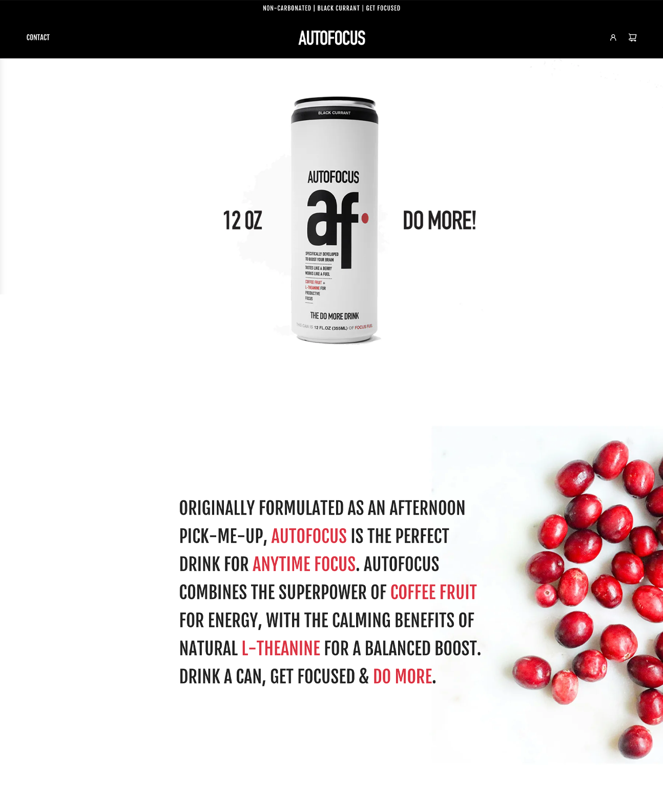
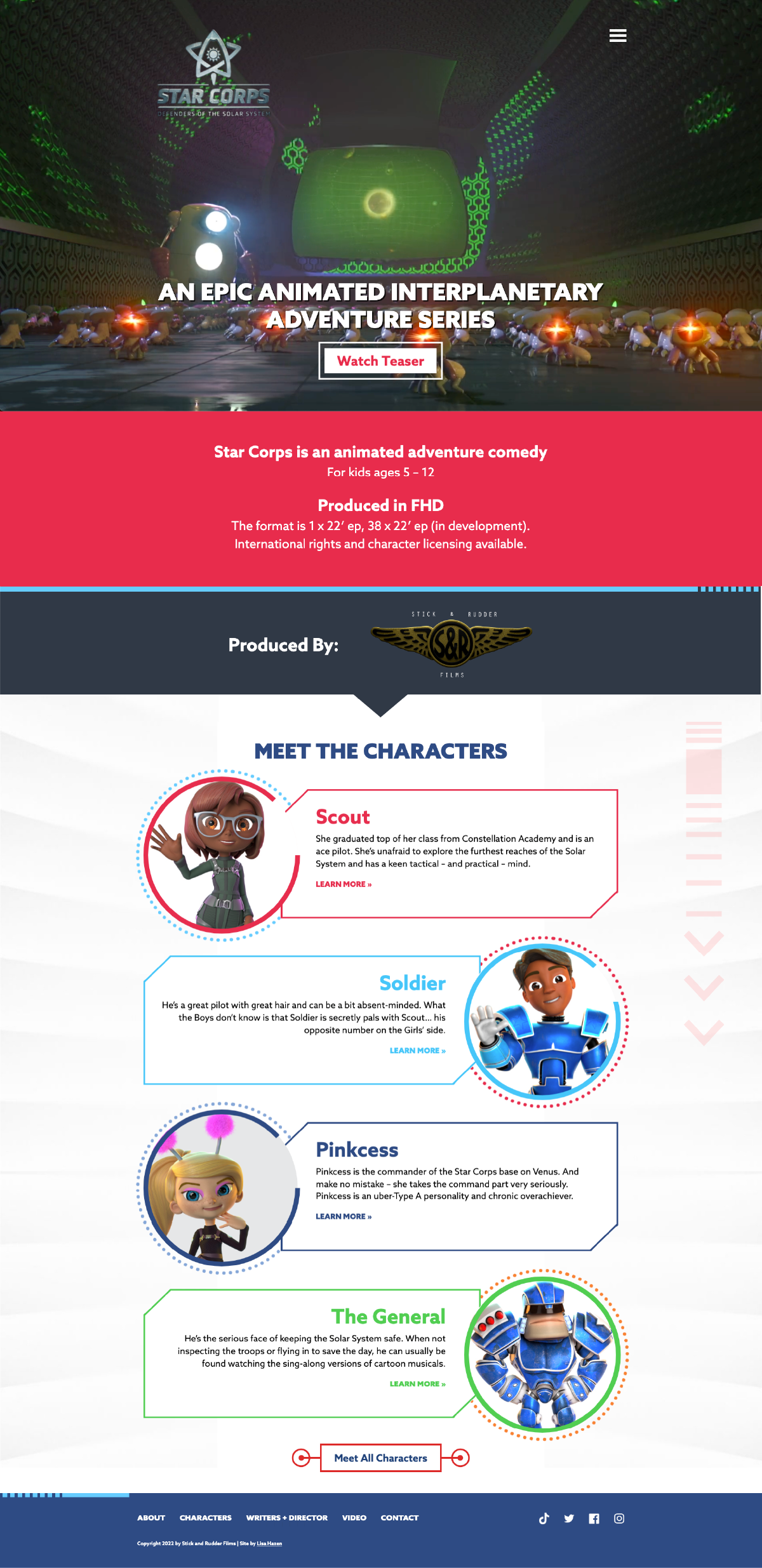
Designing for the Book Industry – HOW Magazine September 2007

Book publishing is a billion-dollar business with intense competition from in and outside the industry. Here’s how top publishers are using design and marketing to set their books apart.

By Lisa Baggerman Hazen

Once upon a time, the book business was pretty straightforward. Books were sold in bookstores. They were found on neatly stacked shelves that beckoned with predictable cover treatments—title, author, and leading image. Whether it was a novel or a cookbook, few titles strayed from this general structure. A book was a book was a book. The end.

But book publishing isn’t what it was 10 years ago. It’s not even what it was last year. The advent of interactive entertainment like video, Web, and gaming compete with books for consumers’ leisure time. And books are no longer relegated to bookstores—you can even find them sold everywhere from big-box stores to gas stations. One glance around a bookstore reveals that there’s no longer a formulaic approach to book design—particularly when it comes to covers. In this marketplace, an inventive approach to book packaging and design can connect the user to a title before she reads a word.

Smart publishers are using design as a tool to set their books apart in this increasingly competitive—and lucrative—market. When an endorsement from Oprah Winfrey can catapult a title to the top of the best-seller list, the involvement of proactive book marketing integrated with inventive design has never been so crucial. Here are publishers who are using design and marketing to create a competitive advantage.

THE DESIGN EDGE
Maybe they shouldn’t, but most people do judge a book by its cover. In fact, cover design is one of the most obvious and effective strategies publishers are using to promote their titles. And the competition is fierce. According to the United Nations Educational, Scientific and Cultural Organization, the number of new books published in the United States has more than doubled since 1996, with 172,000 new titles published in 2005. Then, factor in slowing book sales (a decrease of 4.3% between May 2006 and May 2007 according to the US Census Bureau).

“It’s the covers that really advertise the work,” says Henry Sene Yee, Creative Director of New York-based trade paperback imprint, Picador. “The cover design needs to stop you in your tracks, make you pick up the book, and read the flap copy. The best way to do this is to create a package that is smart, professional and—most importantly—designed to connect with the target consumer emotionally.”

When designing the paperback cover for Tom Wolfe’s I Am Charlotte Simmons, the story of a virginal college girl’s sexual awakening, Yee immediately faced some obstacles. The reviews weren’t as positive as hoped for and hardcover sales reflected that. Although Wolfe was already a well-established author, Picador wanted to market this particular title to a generation of college-aged readers who may not have been as familiar with Wolfe’s previous work.

“Some people saw the story as more of a young girl’s downward spiral into sexuality,” says Yee. “But I didn’t see it that way—I saw Charlotte as blossoming. I started playing with format and die-cuts as a way to represent this vision.”

To do this, Yee designed a two-tier system for the cover. The top flap was dark, with forms and twigs establishing the background, a white silhouette of the heroine, and a die-cut in the shape of her dress peeking through to a chartreuse pattern on the page behind. When the top flap is opened, the title is revealed, along with flower blossoms and lighter colors. “This design was meant to reveal the true nature of the book—that she was blossoming,” says Yee. “It was fun to do something that was conceptual, but in a smart way.”

But successful design doesn’t start and end with the book’s cover. Considering the book’s entire package is key to a successful publishing strategy.

“We believe a good design is as important as good text, so we’ve always pushed to make the graphic design of our books work as hard as it can,” says David Borgenicht, President and Publisher of Quirk Books, a Philadelphia-based publisher of what they call “impractical reference and irreverent nonfiction” books.

Take Quirk’s take on the traditional parenting book, The Baby Owner’s Manual. The authors provide practical and useful parenting advice. Yet, it’s written tongue-in-cheek, with an editorial approach that treats the baby as if it were a VCR. This tone is followed through with illustrations inspired by technical user manuals, with a hip, iconic treatment.

“We wouldn’t have sold 350,000 copies of this book if it wasn’t graphically amazing,” says Borgenicht. “It would be just another parenting book. Instead, it’s a parenting book that’s sold in the Tate Modern gallery in London.”

BOOKS AS ENTERTAINMENT EQUALS
It’s naïve to think that it’s just the youth market that is turning to video games, Web, and movies for entertainment. According to Parks Associates Research and Analysis, 34% of adult Internet users play online games. And according to a study by the Associated Press-Ipsos, one in four Americans did not read a book in the previous year.

With an ever-precious window of free time for personal leisure, book publishers are looking for ways to make books relevant in a market that is, frankly, less friendly to books. “We have the attitude of an entertainment company, not a book publisher,” says Borgenicht. “We realize that we’re competing not just with book publishers, but video games, the Internet, DVDs, iPods, and cell phones, so our books have to be as exciting as those things. Plus, we make our books as interactive as books can be. We have pop-up books, books with removable clues and more.”

Look no further than Graceland: An Interactive Pop-Up Tour. “This is a book you want, even if you’re not an Elvis fan,” says Borgenicht. “We wanted this to be a pop-up book that had a reason for popping up. We went all out with the design and paper engineering. I think it appropriately represents the kitsch and coolness of Elvis.”

Some publishers have found ways to incorporate different media into the books themselves. “We’re increasingly integrating DVDs and CDs into many of the books we publish,” says Patti Quill Marketing and Publicity Manager for San Francisco-based publisher Chronicle Books. “We recently published The Designer’s Toolkit, a book that includes not only strategies for grid design, but a companion CD with 500 ready-to-use templates.”

And in Lennon Legend, Chronicle Books reinvents the traditional celebrity biography by creating an interactive package. In addition to the book, there are archival photographs and reproductions of Lennon’s handwritten lyrics, drawings, an audio CD and more. These types of elements serve to broaden the book’s appeal.

It isn’t just the quirky books that lend themselves to format innovation. Published by the Harper Collins imprint, William Morrow, Kockroach is a literary novel that literally takes Kafka’s Metamorphosis and turns it on its head—author Tyler Knox’s protagonist is a cockroach who awakens to find that he’s become a man. Designer Will Staehle is a Los Angeles-based designer with more than a dozen covers under his belt tasked with designing this book.

In addition to a noir-ish treatment for the cover, with a cartoonishly out-of-scale men’s shoe about to flatten the book’s title on a city street, Staehle incorporated an interesting design element that went beyond the cover. “When you flip the pages, it’s a reverse animation of Kafka’s metamorphosis,” says Staehle. “It’s little stuff like that can set the book apart and keep it true to the story.”

BEYOND THE BOOKSTORE
The Book Industry Study Group reports that there are 15,000 stores in the U.S. that carry books, but only 8,000 of these are traditional “bookstores.” This also impacts the way the books are designed.

When Oprah Winfrey chose Jeffrey Eugenides’ book Middlesex as a selected title for her book club, Picador was thrilled. But this unusual book about a first-generation Greek hermaphrodite needed to be packaged in a way that would convey its story in an appealing way to an enormous nationwide audience. And this didn’t necessarily mean foil stamping and bright colors.

“Despite the fact that this was going to be a book with a wide commercial audience, I pushed for the cover to be a series of grays rather than color and metallic,” says Yee. “I wanted to show restraint as a way to represent the different gray areas between gender, culture, and generations that the book represents. I used interconnecting smoke and clouds to tie together illustrations on the cover that represented different aspects of the book. Everything just started clicking,”

The approach paid off with an elegant cover treatment that worked on a variety of levels, including an attractive package for mass market that was still true to the book. “I like to strip things down to their essence,” says Yee. “You have these books that are so complicated. Different themes, tones, plot points, etc. It’s necessary to take all this information but not make a kitchen soup design. I wanted to create something with complexity that identifies this book among a sea of books.”

Sales outside conventional book venues don’t mean that publishers are neglecting the traditional booksellers. Maintaining close relationships with bookstores is as important as ever before. “Chronicle still maintains a strong relationship with all the traditional avenues,” says Quill. “We do direct outreach to schools, direct marketing, one-on-one meetings. We’re not losing any of the tools in the toolbox. We’re taking advantage of any and all possibilities.”

BRINGING IT ALL TOGETHER
Editorial, marketing and design need an integrated approach to promote books effectively. But, in many ways, it’s how design is leveraged that helps complete the package.

“Design is central to Chronicle’s strategy,” says Design Director Sara Schneider. “That’s not to minimize anything else, but it’s never an afterthought. During the concept phase, we constantly ask, ‘How will we make this book distinctive, spirited?’ A unique look and feel is essential to this.”

HOW has its own line of design books that cater to creative people of all stripes. But it is HOW’s structure that keeps the books’ promotion in motion. “Our core graphic design titles, like Jim Krause’s Index books, are promoted in the magazine, on our Web site, in our email newsletters, and on our blog,” says Megan Patrick, Senior Editor for HOW magazine and books. “For HOW’s other books, the bulk of our marketing efforts are focused on behind-the-scenes tactics like getting our books on display at major retailers and doing big promotions at book-industry events like Book Expo America.”

Book lovers needn’t despair. Just because the market is changing doesn’t mean that books are being displaced. “We know there is still an audience out there for books,” says Schneider. “But we’re looking at what inspires and delights people about books, and capitalizing on that. We’re not abandoning the book as a form, but capitalizing on what is most appealing about it and taking it even further.”

Lisa Hazen has more than 14 years experience in publishing, ranging from being a former HOW editor to a book author to working as the Web Director at Chronicle Books for more than eight years. She now owns her own Chicago-based writing and Web design firm. www.lisahazen.com // lisa@lisahazen.com

RESOURCES
Quirk Books, Philadelphia, www.quirkbooks.com
Picador, New York, www.picadorusa.com
Chronicle Books, San Francisco, www.chroniclebooks.com
HOW Books, Cincinnati, www.howdesign.com
Will Staehle, Los Angeles, www.lonewolfblacksheep.com
Henry Sene Yee, New York, http://henryseneyee.blogspot.com/
Harper Collins, New York, www.harpercollins.com

CAPTIONS

BABYOWNER.JPG
Quirk Books’ Baby Owner’s Manual stands out from a glut of parenting books by adopting a clever, irreverent approach and following it through with the design and illustration. The copy is written as a user’s manual, as if the child were a VCR. The illustrations used are inspired by the functional designs in user manuals, yet with a modern influence that gives it a hip edge. This approach makes it appealing to moms and dads and helped sell more than 350,000 copies worldwide.

CHARLOTTE/FRONT
CHARLOTTE/SETBACK
Picador wanted to market Tom Wolfe’s I Am Charlotte Simmons to a younger generation, as opposed to some of the author’s more traditional fanbase. To evoke the blossoming of the book’s heroine, designer Henry Sene Yee used a two-ply cover approach. The top cover was dark, with the silhouette of Charlotte and a die-cut in the shape of her dress peeking through to the setback behind. When the top flap is opened, the title is revealed, along with blossoms set against a lighter background.

DESIGNERSTOOLKIT
If you can’t beat ‘em, join ‘em. Since books are already competing with the Web, video games, and DVDs, publishers like Chronicle Books are finding ways to incorporate new media into their existing publishing programs. The Designer’s Toolkit is a book about different grid designs that also includes a CD with 500 templates for download.

GRACELAND
GRACELAND INTERIOR
Experimenting with their books’ format is one of the ways that publishers are making their titles stand out. Quick Books’ Graceland is an interactive pop-up book that takes readers on a virtual tour of Elvis’ legendary estate. Something so unique and over-the-top is a perfect fit for this campy subject.

KOCKROACH
Unusual books arent’ the only ones with opportunities for innovation when it comes to format design. Clever designers are finding ways to make the packaging of novels stand out, as well. Kockroach is a reverse take on Kafka’s Metamorphis—in Kockroach, a cockroach wakes up to find himself as a man. Designer Will Staehle made a flip animation with the pages where you can watch this metamorphosis.

LENNON LEGEND
LENNON LEGEND INTERIOR
What is considered an actual book is also evolving in the changing market. Lennon Legend isn’t just a biography of John Lennon. Rather, it is also complete interactive package for fans and collectors that includes reproductions of posters, handwritten lyrics, ticket s and of course, an audio CD.

MIDDLESEX FULL
When Oprah chose Middlesex as one of her book club selections, the publisher was charged with designing a cover that would make this book appealing to an enormous audience. Despite the temptation to splash color and starbursts on the cover, Creative Director Henry Sene Yee took a refined approach, using a series of grays on the cover to tie together the complex storyline while creating an attractive package that works.

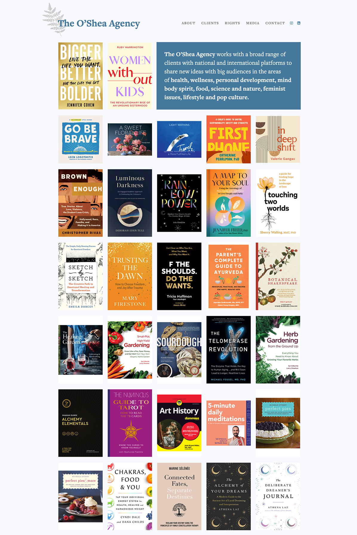
DESIGNER’S COMPLETE INDEX (I assume you guys will have this image.)
This is more than just a collection of books—the Designer’s Complete Index is meant to be a package that includes an entire series of popular design books in one place. HOW promotes this book through its existing network of the magazine, Web site, blog, and e-newsletters.
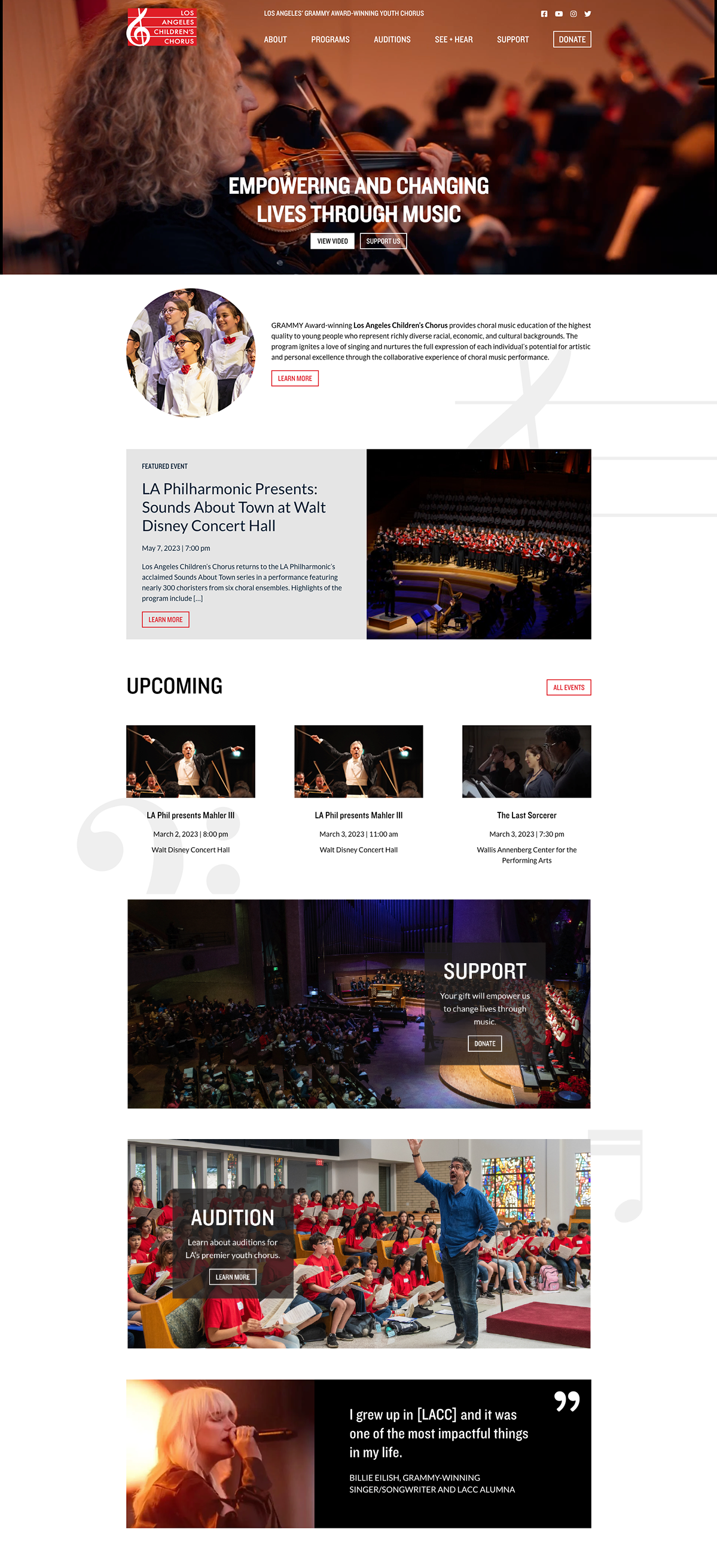
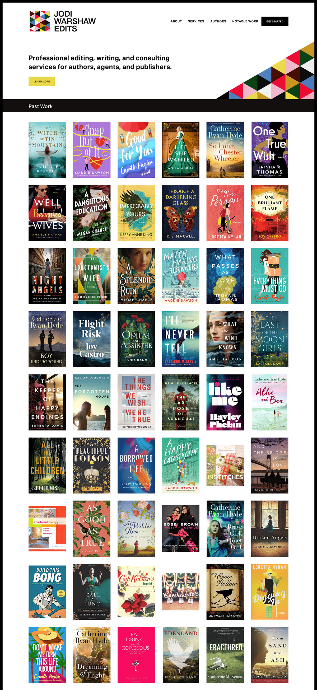
Studio on Sixth launch

I designed this pretty little site to promote a cottage for rent in San Francisco’s Sunset neighborhood. Quick and dirty, this site took just three days to build and launch. Check it out at Studio on Sixth. Just goes to show, there is no job too big or too small!

Guru of New launch

Sarah Browne, a digital strategist and market researcher based in Carmel, California. She wanted me to create a WordPress blog for her with a charming retro feel that she could use as a place to profile what hot new products and trends live up to the hype, and which do not. The Guru of New is the result.

Red Room placeholder

A small job was designing a placeholder page for a fantastic site that is coming in a few weeks named The Red Room. This site will be an online home for all of the world’s best writers—a place where they can post information directly to their readers and easily host their online presence. Writers including Salman Rushdie, Norman Mailer, Amy Tan, and Po Bronson are already committed to participating.

Mommy Track’d Bookstore launch

The folks over at Mommy Track’d hired me to design their bookstore portion of their redesigned site. This was an interesting challenge, as it involved going into their existing templates and integrating an Amazon store within their framework. (Without making it look like the user ever left their site.) The result (I hope you agree) is seamless.

Incorporating Movement launch

I designed this site for New York-based Pilates instructor, Rebekah Rotstein. She wanted a site that would bring together the health and life benefits of the practice, and promote her new business as an instructor. Shawn created her logo, which provided the launching point for the design direction. There’s even a Spanish translated version!

June Chronicle Books Newsletters

Chronicle never disappoints with the books it asks me to write about monthly for their email newsletters. The featured books in June were Pretty in Punk, a book teaches knitters not how to craft cardigans, but rather punk mohawk hats and skull-and-crossbones armwarmers. I also interviewed the authors of Extreme Barbecue, who themselves interviewed guys who barbecue pigs in steel drums and coffins (not used, thank you). And lastly, I wrote about the pop-surrealist work of artist Alex Gross.

Kids Off the Couch

In my quest for world domination of mommy blogs, I started writing for another. Kids Off the Couch offers different activities for families that don’t involve anything you can see on Nickelodeon. I am the Chicago guide, which means that I’m discovering a bunch of fun things for Finn and I to do. Tune in for your weekly adventure!

May Chronicle Books Newsletters

In May, there were some really interesting books to write about for Chronicle’s enewsletters. I took a “walk down memory lane” (har har) with Core Memory, a photographic (and surprisingly beautiful) look back at vintage computers. Also, I spoke with Joyce Ostin, who photographed everyone from Tom Hanks to Steven Spielberg for Hollywood Dads.

Web Design Work for Golin Harris Presentation

Working with big firms like Golin Harris mean that I can’t talk about the details of the work we do because of brand confidentiality and work done on spec. But let’s just say that it was fascinating to conceptualize a well-established brand through a proposed Web site design that is very of-the-moment. Frustratingly obscure description? Email me and I’ll tell you more.

Album Art for the iPod Generation – HOW Magazine, June 2007

Download article as a PDF

Beck reacquaints fans with the physical CD by arming them with stickers and a blank canvas, then challenging them to design the cover for his newest release. (more…)

April Chronicle Books Newsletters

I love writing the monthly enewsletters for Chronicle Books. Every month, I get a box full of fascinating books that really resonate with me. In April I wrote about the enigmatic designer Florence Broadhurst (who was mysteriously murdered in her home), pastry chef Emily Luchetti’s favorite recipes, and graphic artist Jeffrey Brown’s new book, Cat Getting Out of Bag

Life’s Golden Ticket site design

Written as an inspirational parable (in the style of The Alchemist or The Five People You Meet in Heaven), this is yet another title that you may be seeing on the NYT best-seller’s list soon. There’s buzz about this book from everyone from James Redfield to Publisher’s Weekly.

Pentagram Papers Article

The article I wrote about the 35th anniversary of the Pentagram Papers project is in the most recent (June) issue of HOW. Read it here.

Redesigned site launch

Finally! I’ve only been in business now for almost a year and am now officially launching my portfolio site. My excuse is that I have been so very busy with client work. Please hang with me while I work out the kinks.

Milk Memos Featured Book on Mommy Track’d

I did an online feature for Mommy Track’d promoting the title, Milk Memos. This charming book was written by two women who returned to work at IBM only to face the bane of the working moms’ existence—the pumping room. This book is a great exploration on how to balance work and motherhood.

Launch of iwasareallygoodmom.com

The site that I designed for this humorous, clever, and wise book that tackles the expectations/myths of modern motherhood just launched at www.iwasareallygoodmom.com. For obvious reasons, this was a project particularly close to my heart. The authors are going to be all over the media—you can find them on The Today Show, Rachael Ray’s show, and Shape magazine.

Launch of NRSV.net

This site was to support the NRSV, or the New Revised Standard Version of the Bible. Published by HarperCollins San Francisco, this revised translation was prepared by the National Council of Churches. with the goal of updating the Bible for a contemporary audience. This is widely accepted as the most ecumenical of all Bible translations.

Rock Your Web Site – HOW Magazine February 2006

Read as a PDF

Simply having a website is no longer enough. It must be a dynamic destination that acts as a bold advocate on behalf of your business. Here’s how to take your existing site and make it into the ultimate self-promotion tool. (more…)

Less Is More – HOW Magazine, February 2005

Read as a PDF

See how 37SIGNALS scrapped web-design work to develop software that retools how designers create — and redefines the way business is done. (more…)

Web Design That Works: Excerpt

The launch of the Internet invoked an industry boom—pretty much anyone who considered himself an analyst was boldly predicting that the Web would squash brick-and-mortar retailers. If people didn’t have to leave home to do their shopping—if they were able to have absolutely anything they needed delivered to their home, how could traditional stores compete? (more…)

Design for Interaction: Introduction

“There are only two enterprises that refer to their customers as users and one of them is illegal.” Michael Hammer

It’s a given that Internet design is all about the user. What choice do Web designers have in a medium where lost links can warrant flaming emails from irate users and poor navigational structures result in lost sales, directly impacting the bottom line? Whether you view this warp-speed feedback process as a blessing or a curse, it means that Web sites are constantly evolving, trying out new approaches to stay competitive and respond to user needs. The Web is both flexible and fickle, and as the medium evolves and redefines itself, it will find new strategies to make users happy, and a few million ways to aggravate them along the way. (more…)

Design for Interaction: Sample Chapter

If talk is cheap, email is a steal. Hastily-written email messages can be fired out to hundreds of people with the click of a button. Instead of spending time writing messages by hand or printing typed letters to paper, email allows users to send messages almost as quickly as they are composed. As a result, nearly anyone will tell you that most of the email we get is junk“from advertising messages that flood the emailboxes of anyone whose email address they can get their hands on to business correspondence dashed off, replete with misspellings, fragmented sentences, and incomplete thoughts to idle chit-chat and recycled jokes. (more…)